CHICKEN RUN: DAWN OF THE NUGGET
All images ©Copyright Aardman Animations/ Netflix 2023
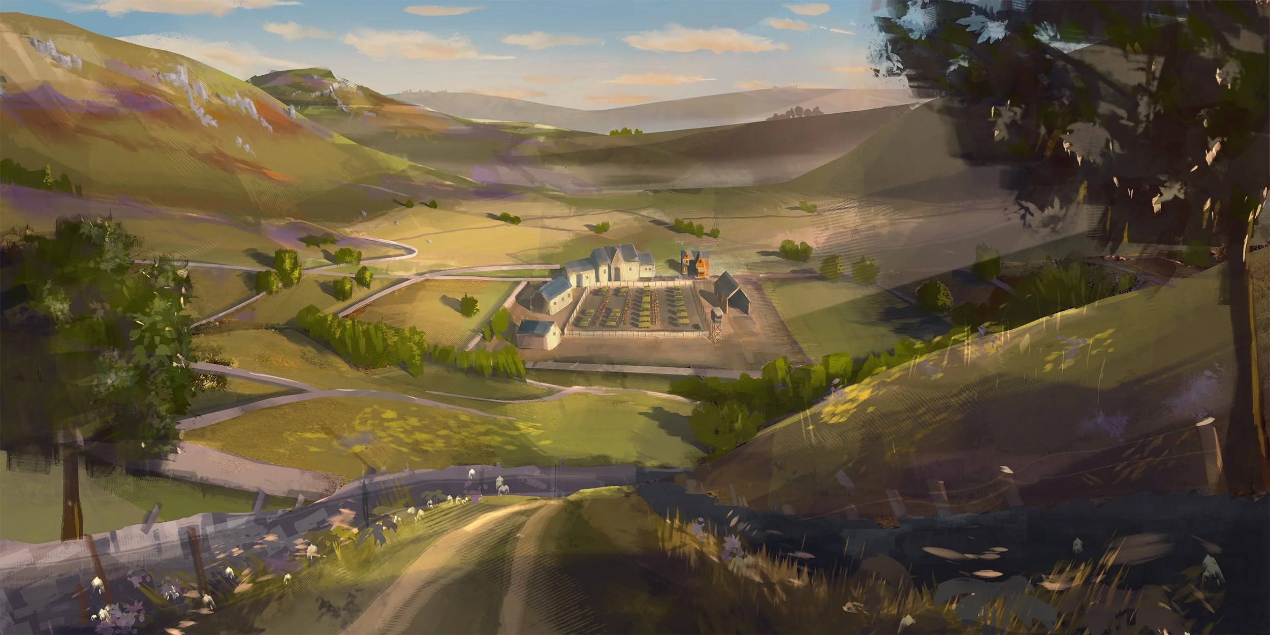
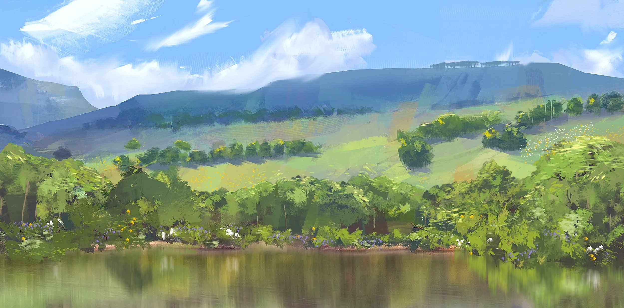
As Production Designer on Chicken Run: Dawn of the Nugget, I developed the visual world of the film from the earliest concepts through to the physical sets and digital environments used in production. Working closely with director Sam Fell, supervising Art director, Matt Perry and the art department, we wanted to expand on the world of Chicken Run while retaining the tactile, handcrafted quality at the heart of Aardman’s stop-motion filmmaking.
The film presented a huge design challenge, moving between chickens and humans and requiring multiple scales across an increasingly expansive world. My role was to develop environments that could work both as physical stop-motion sets and as digital extensions, while maintaining a consistent visual language across the film.
CHICKEN IDYLL: THE ISLAND
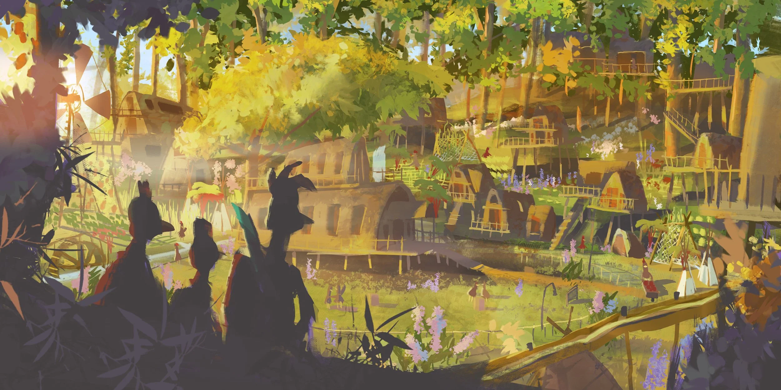
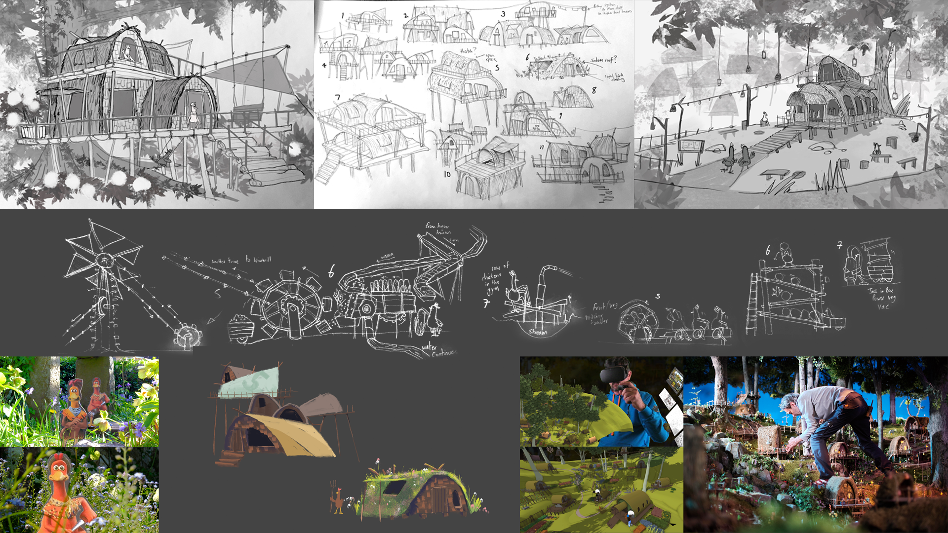
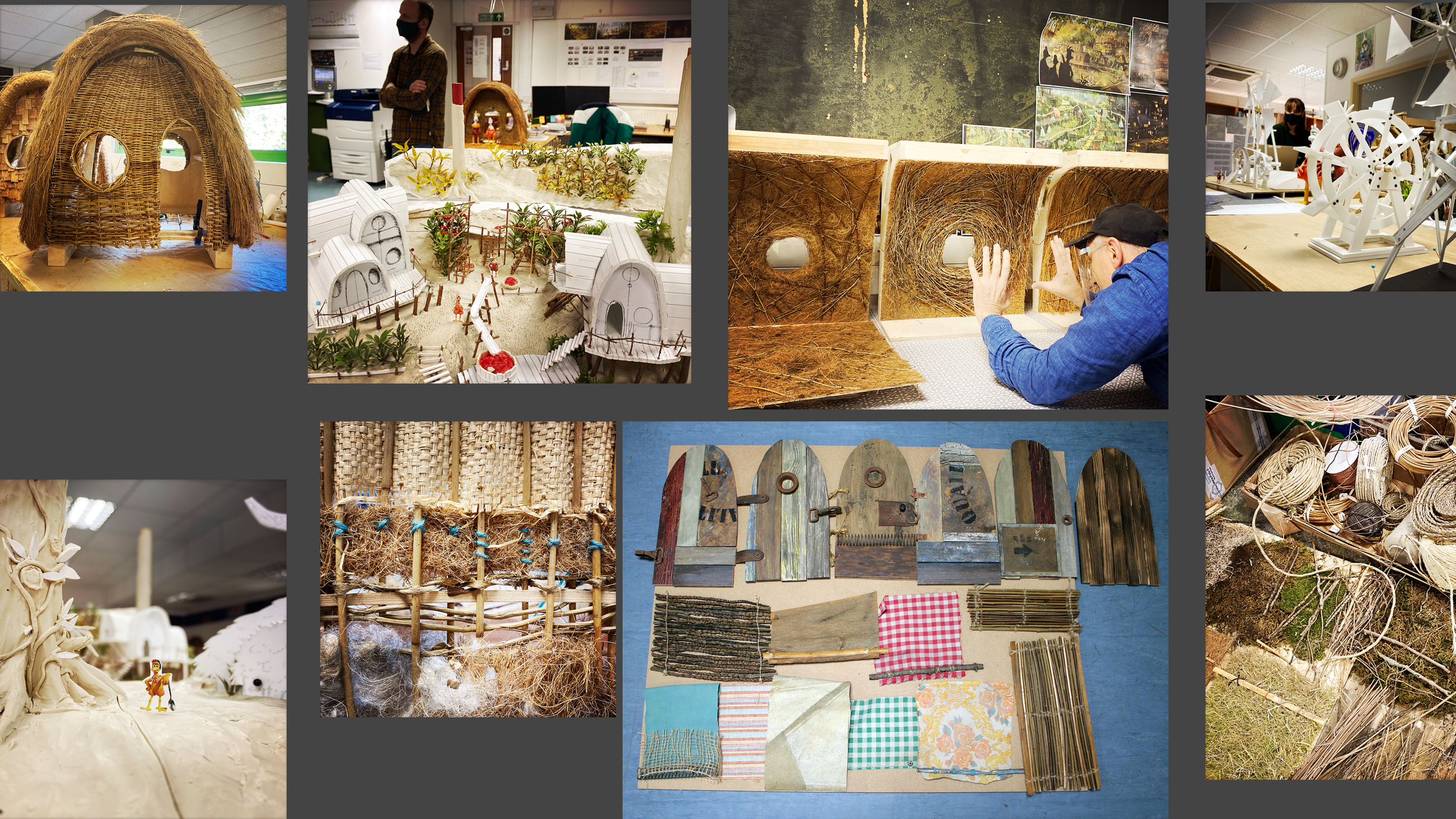
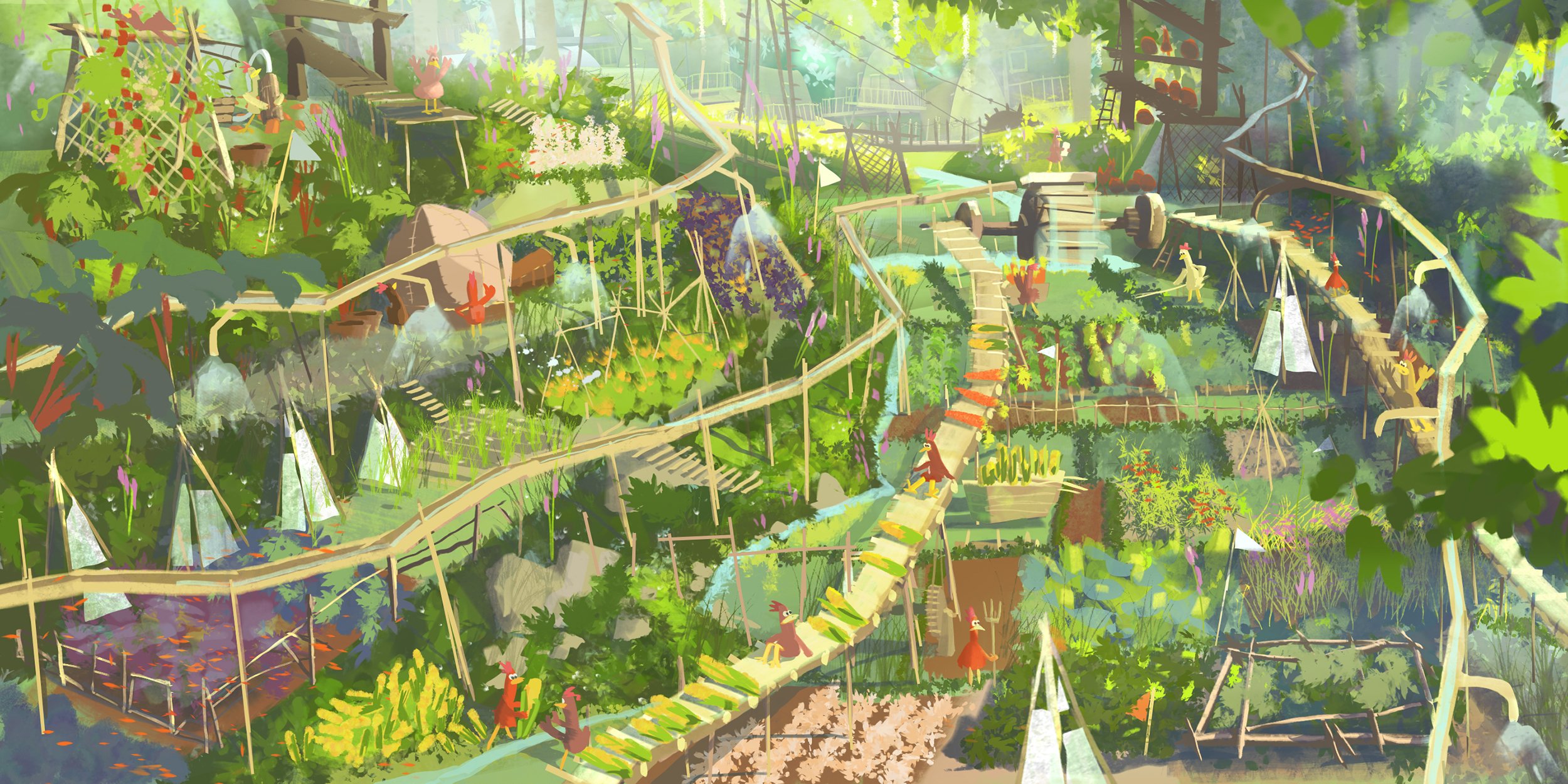
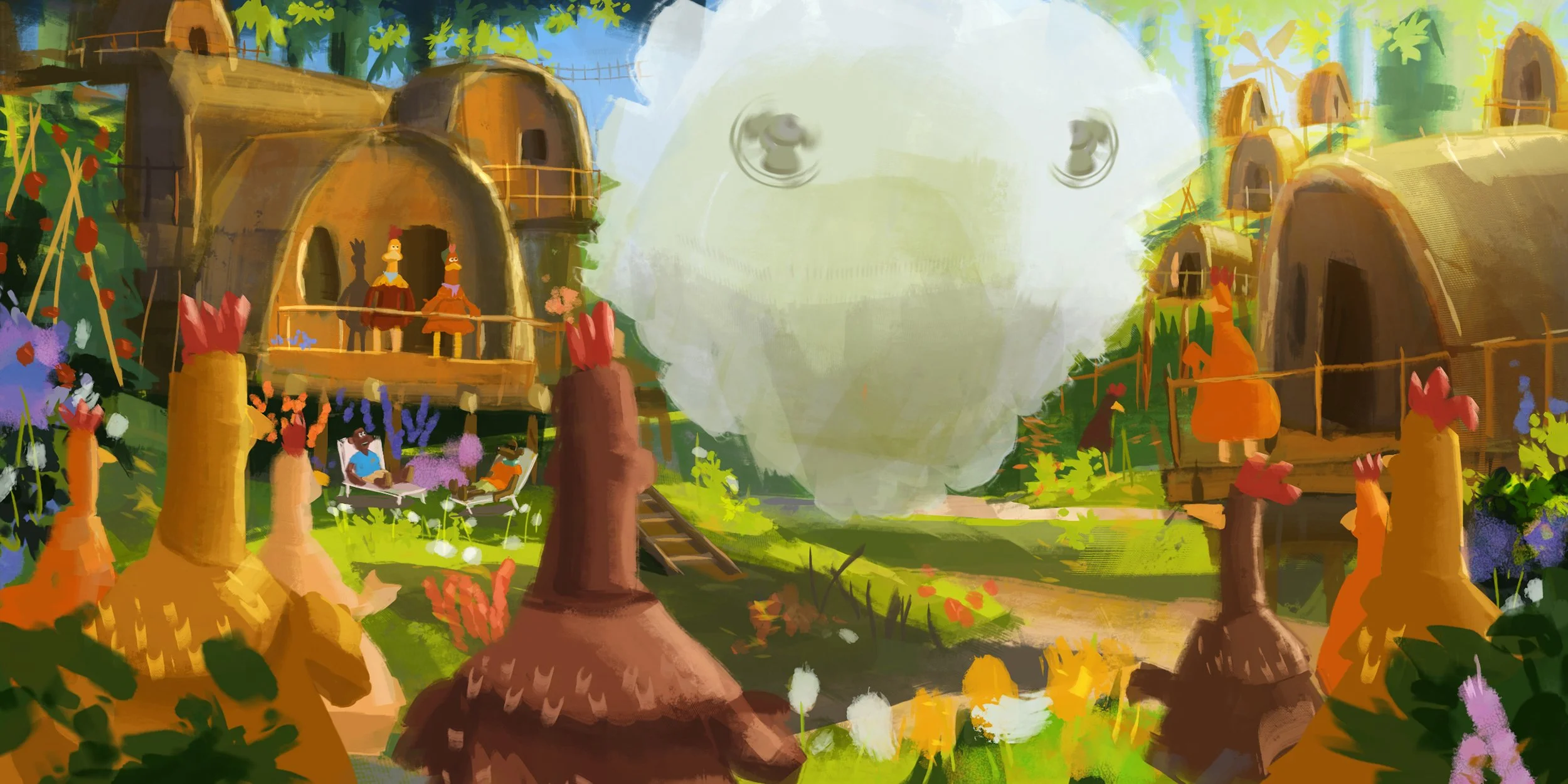
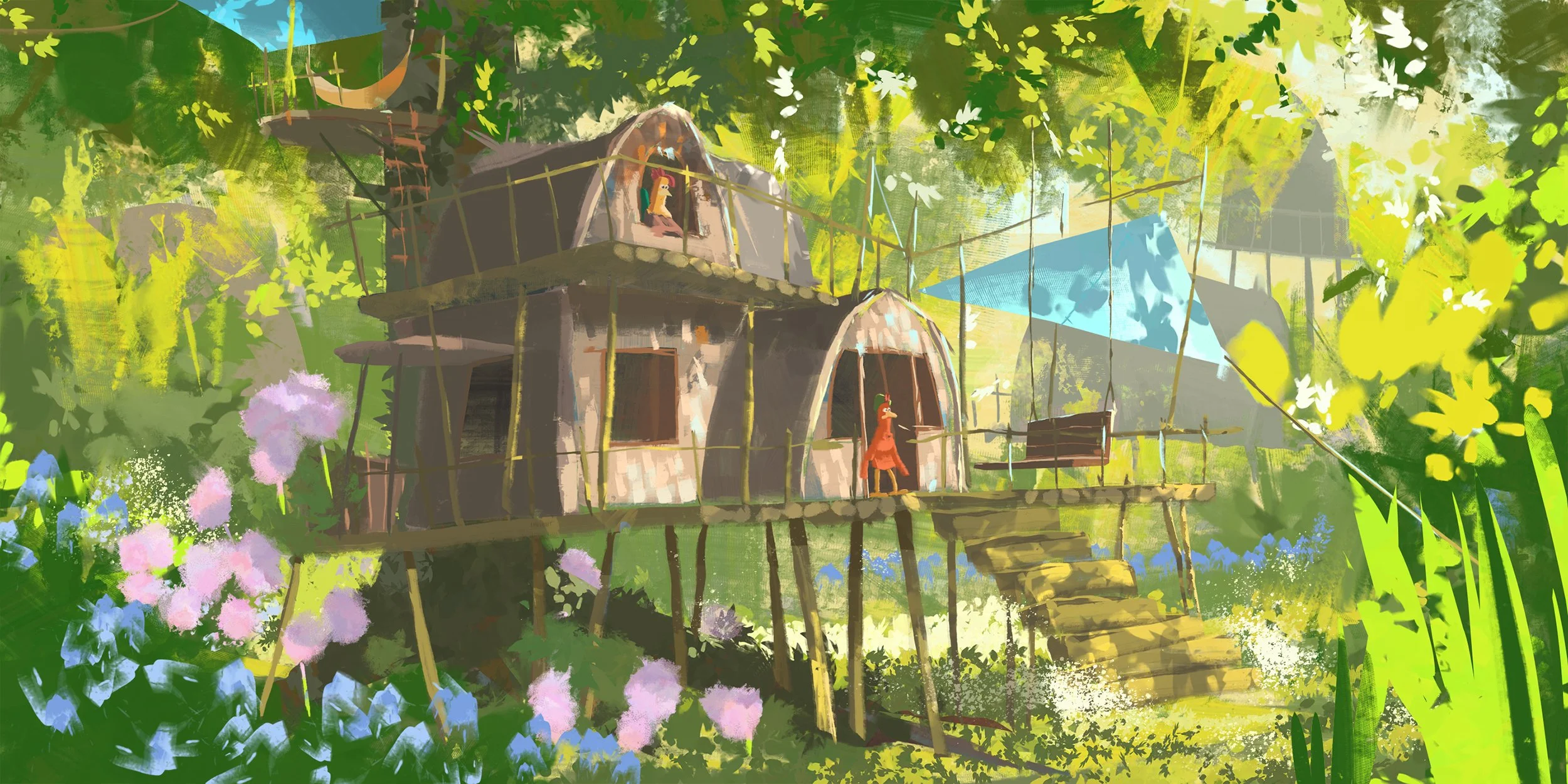
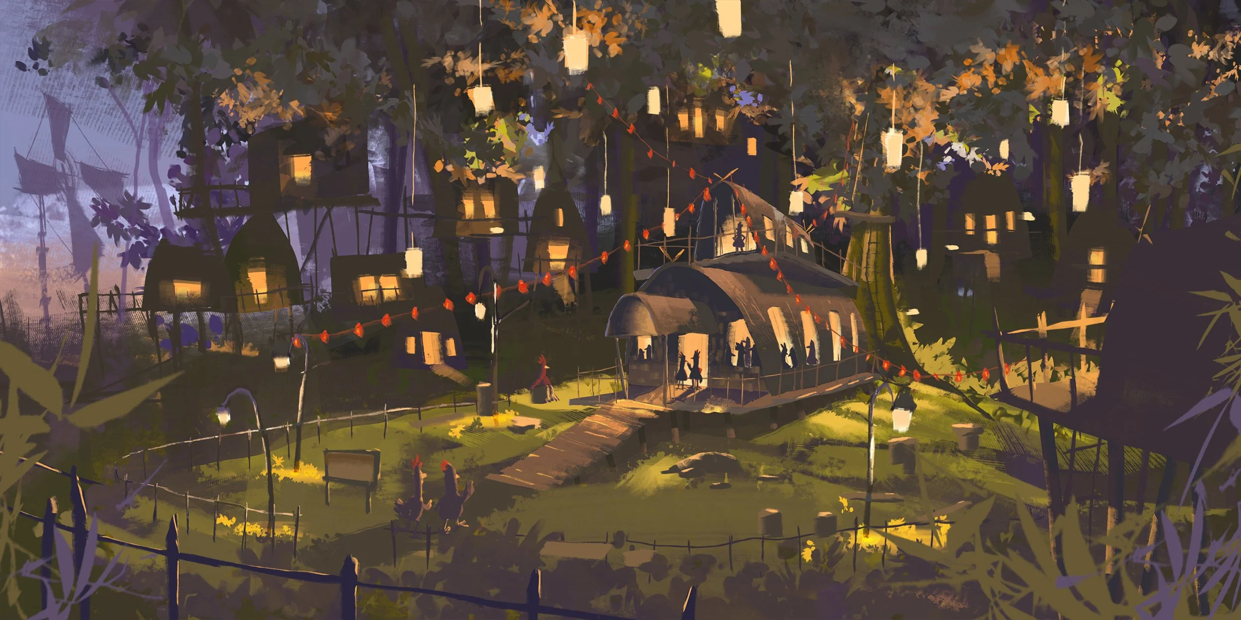
Ginger’s island was conceived as a handmade chicken utopia — an improvised world of huts, trees, flowers, gadgets and found materials, built from the resources around them. It needed to feel organic, tactile and full of character, reflecting the community they had created and the freedom they had finally found.
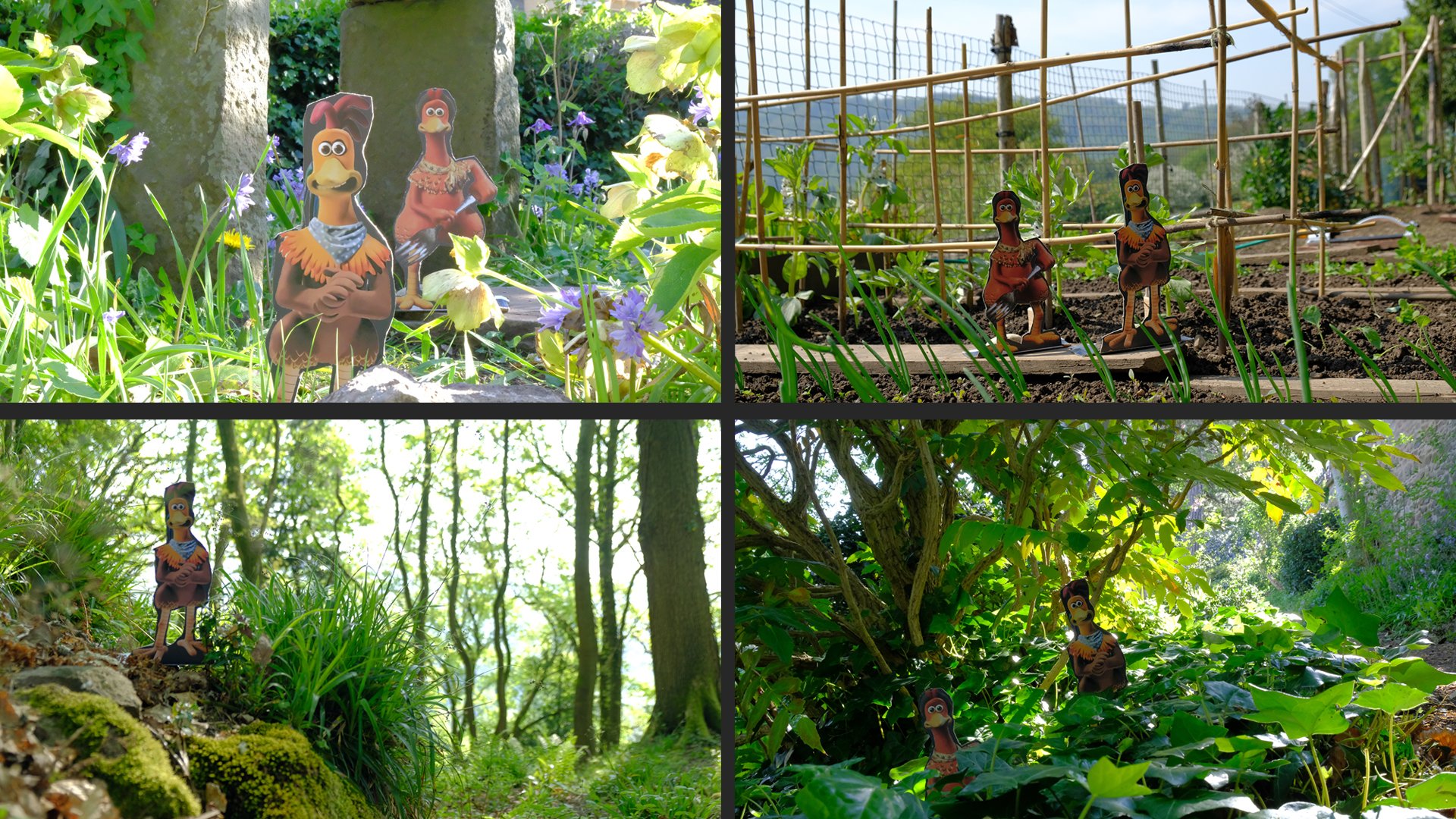
The island became the largest physical environment on the production. Developing it in VR allowed us to explore its geography and scale as a complete landscape before translating the design with the art department into a series of practical sets in 2 scales.
VR DESIGN
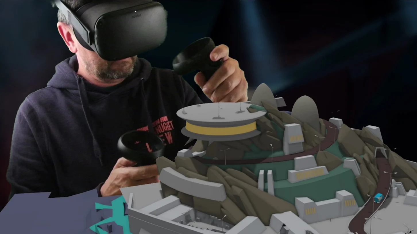
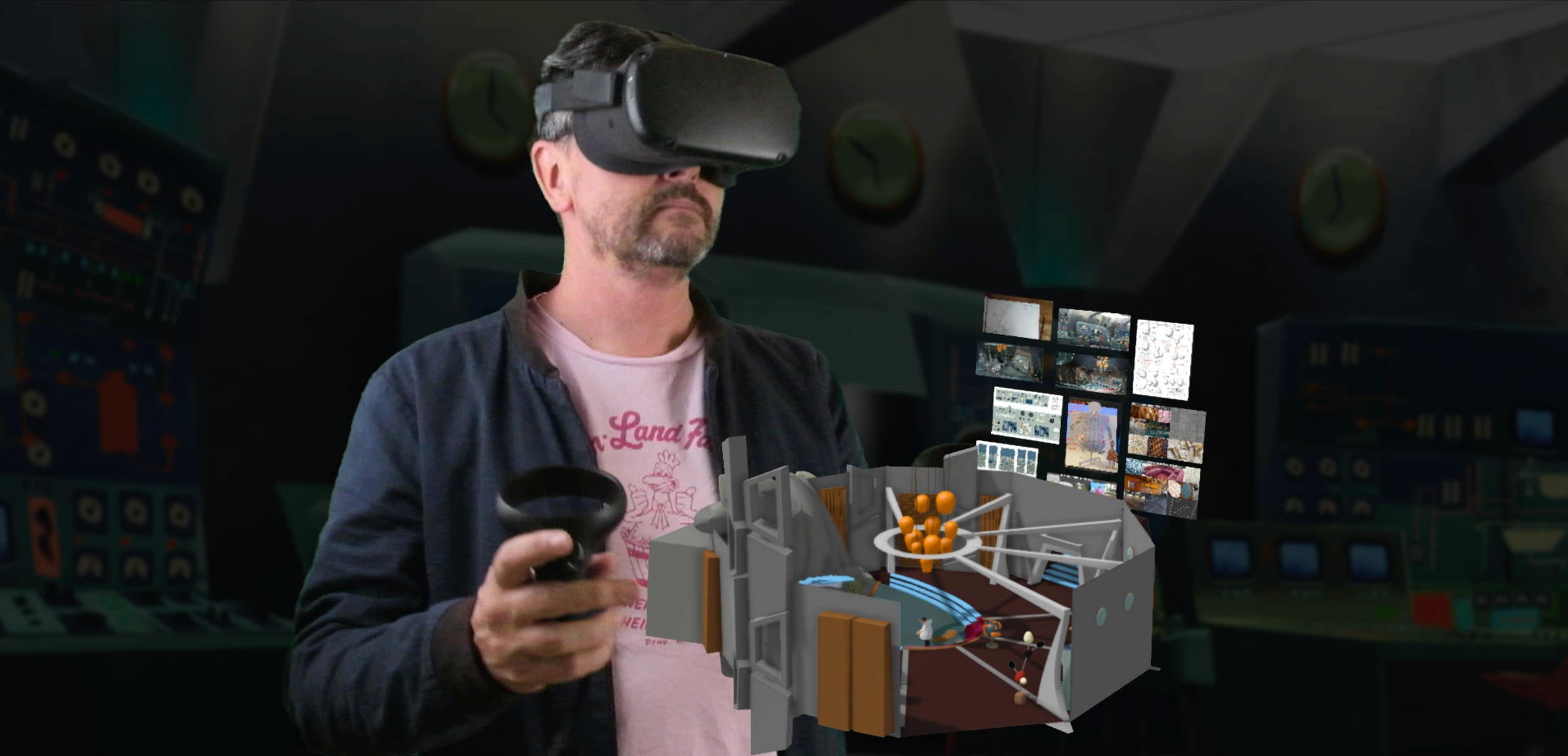
VR became an integral part of my design process, allowing me to move beyond the traditional 2D concept and explore the film as a three-dimensional world. Using Gravity Sketch, I could build environments at scale, walk through them, explore camera positions and understand the relationship between characters, sets and locations long before anything was physically constructed.
The virtual environments became a shared blueprint for the production, allowing creative and technical decisions to be made early and giving different departments a clearer understanding of the world we were building. For stop motion, where physical sets are complex and time-consuming to construct, this became a powerful way of designing, testing and refining the film before committing to the build.
RAT’S YARD
THE COMPOUND
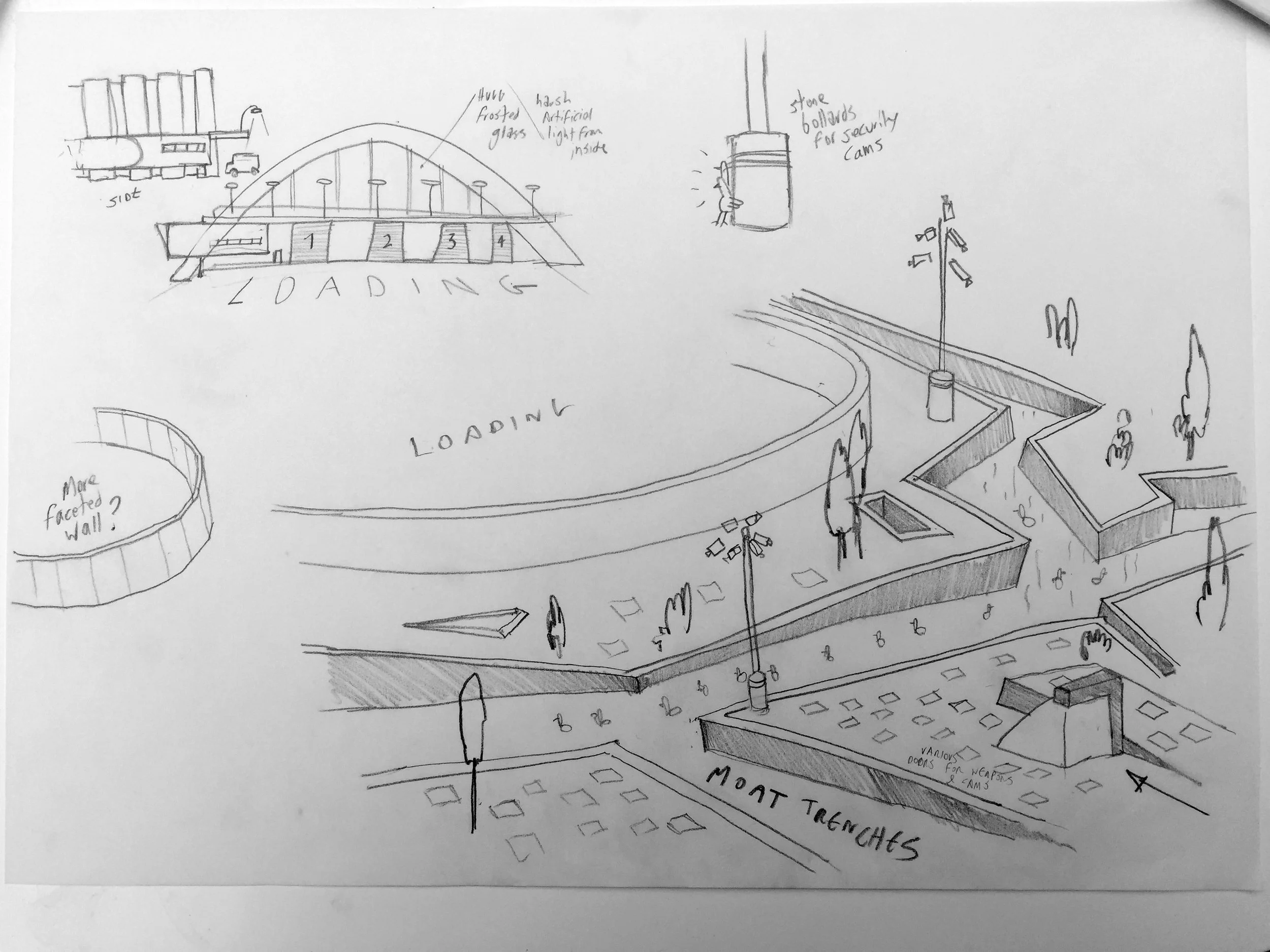
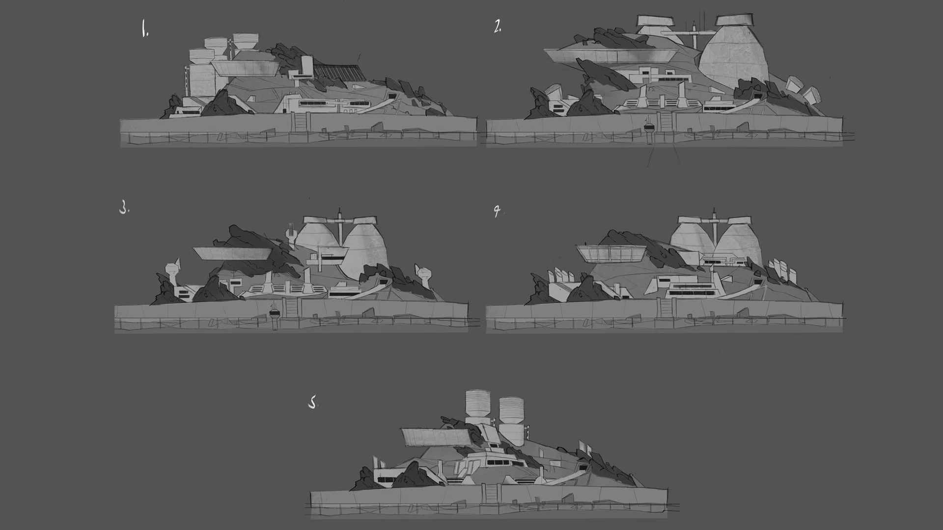
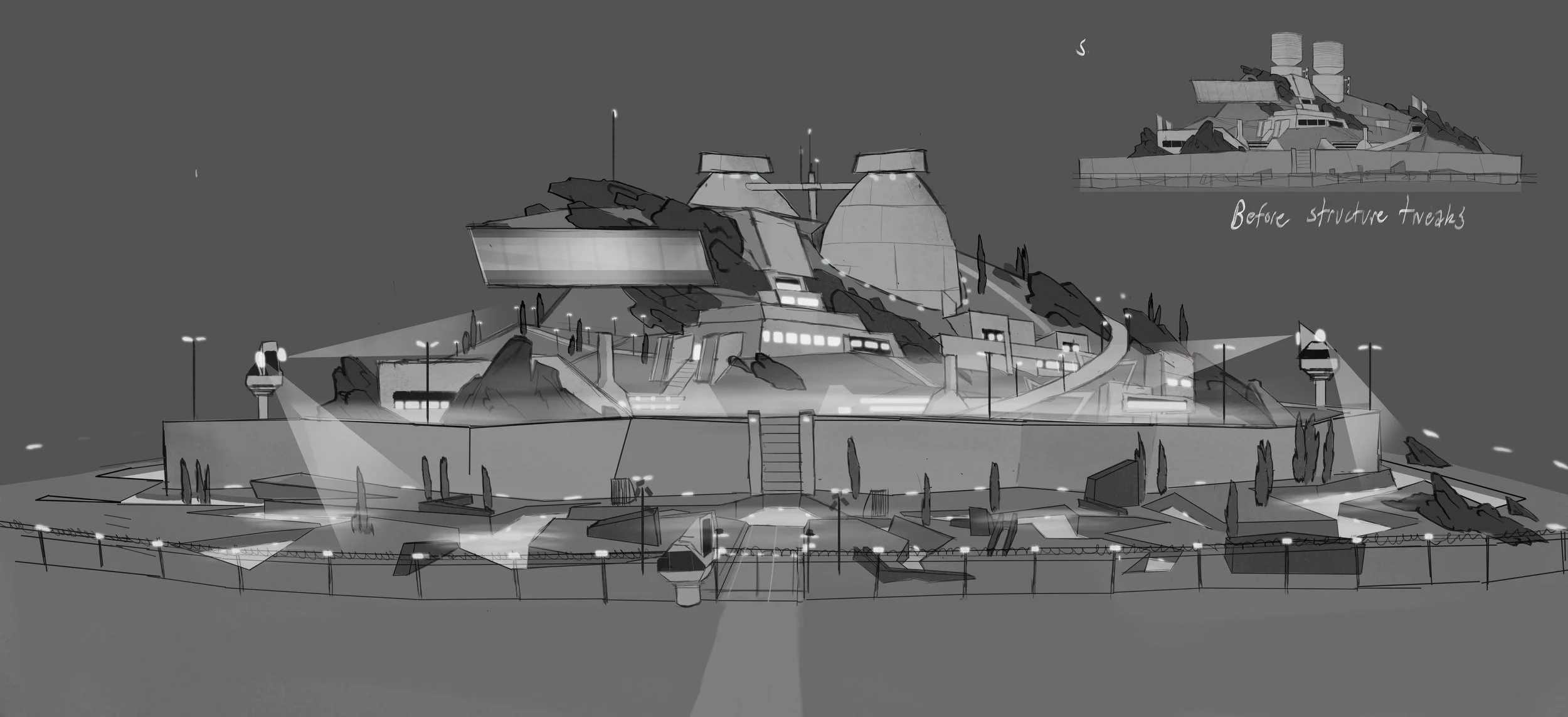
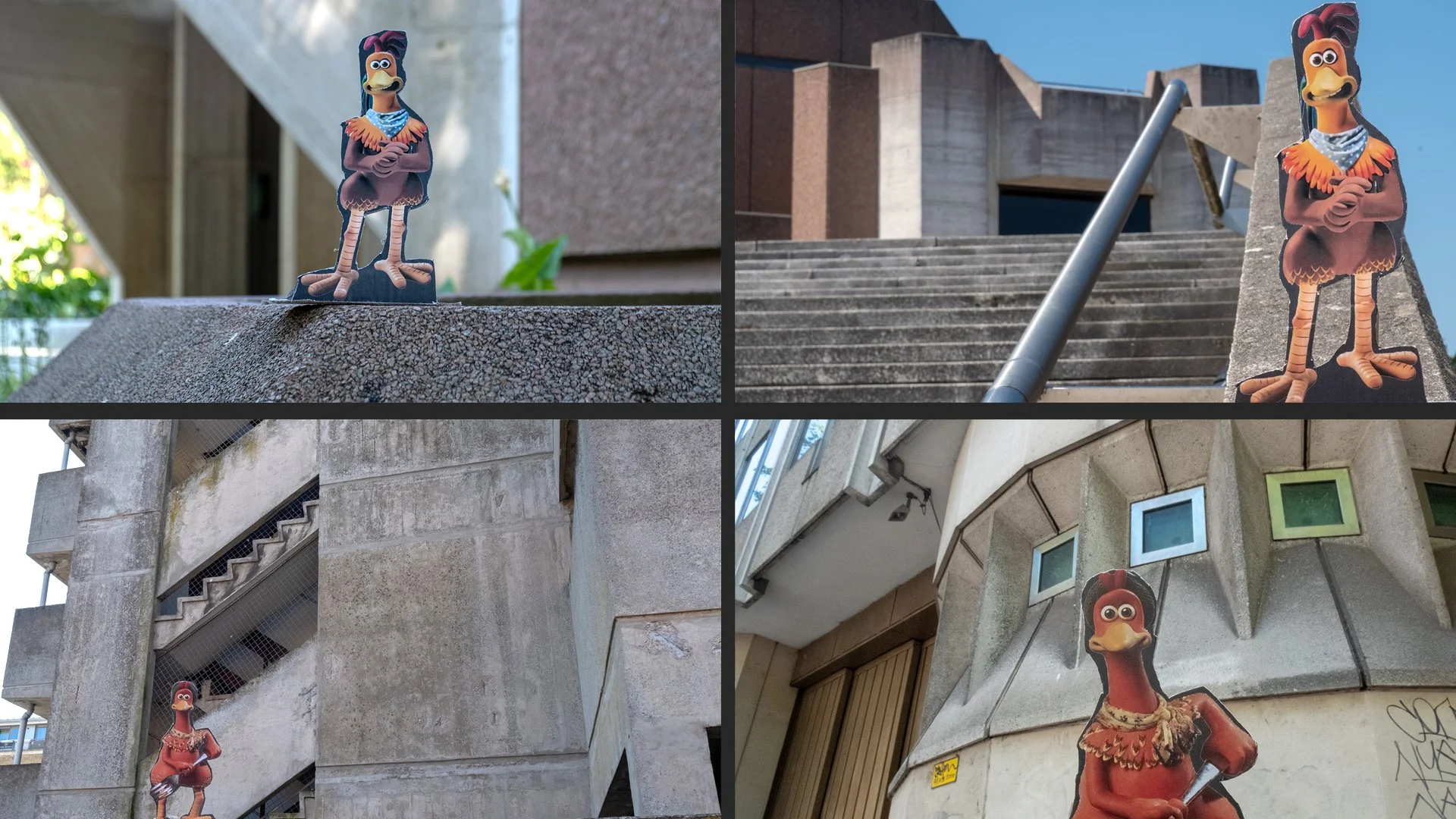
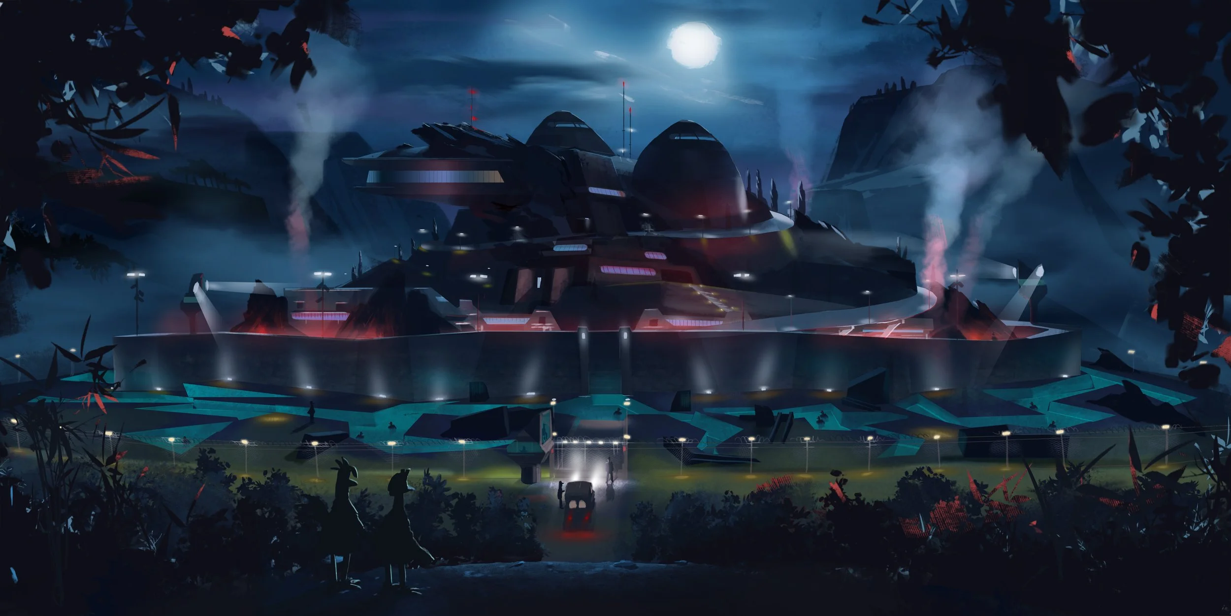
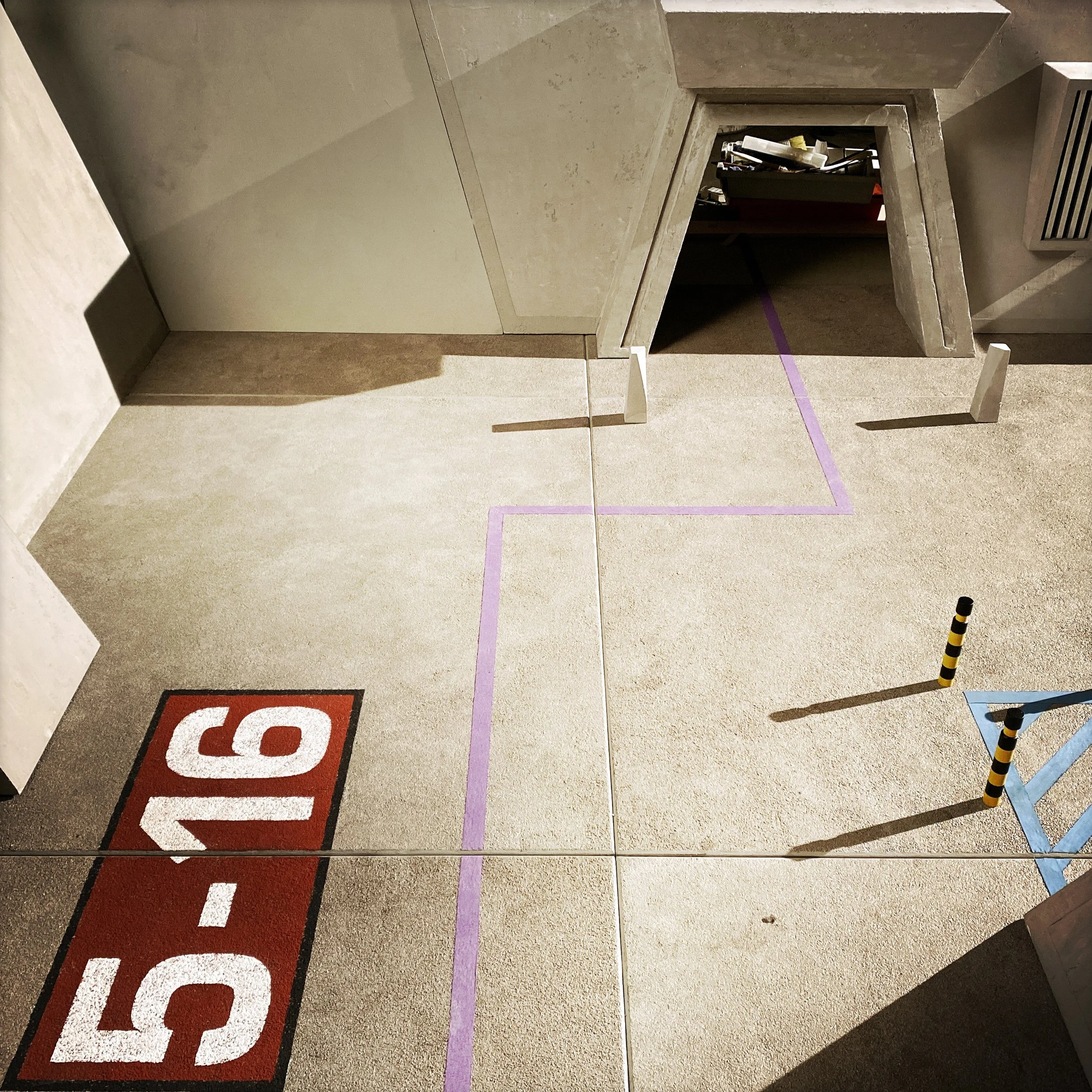
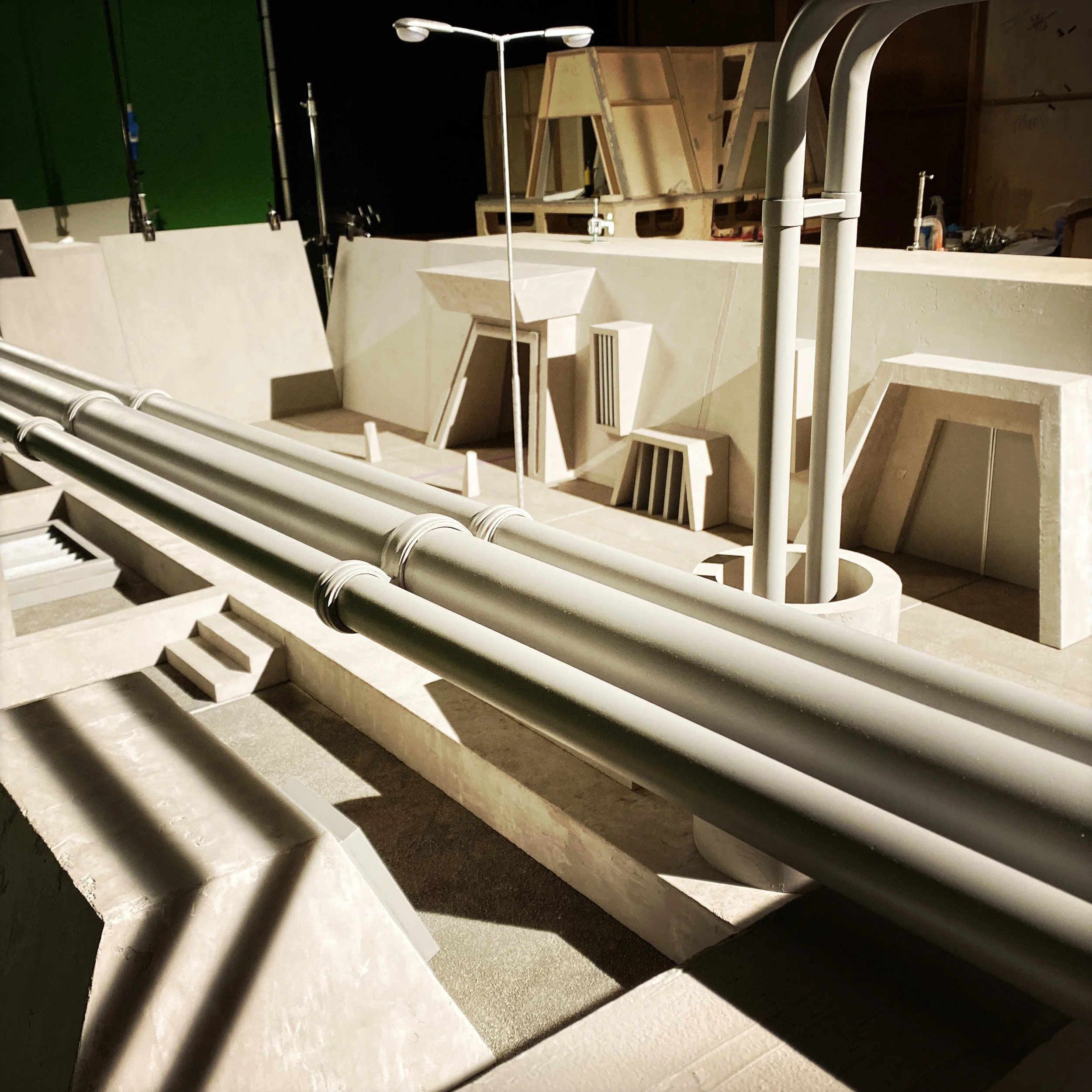
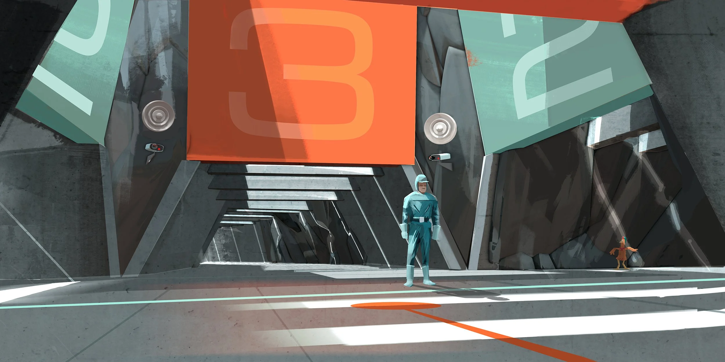
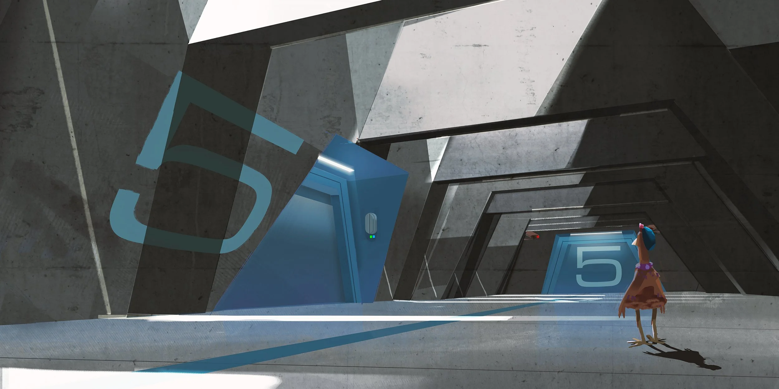
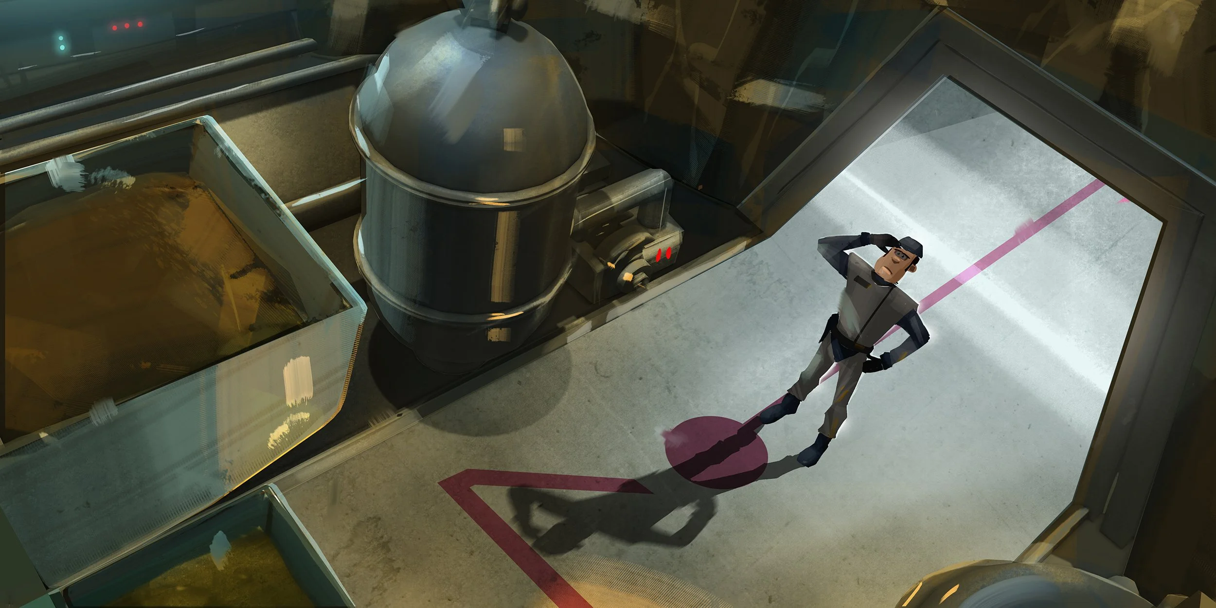
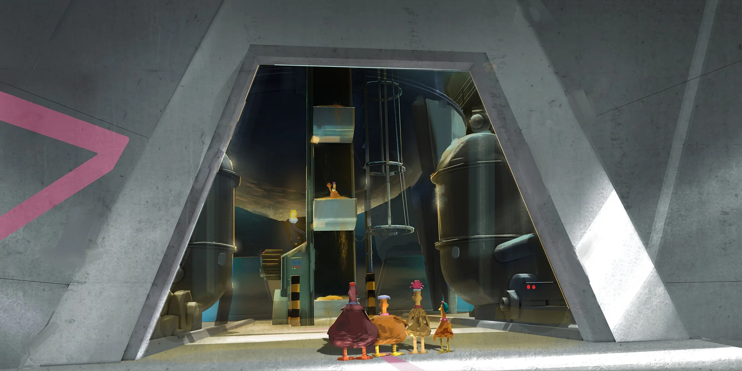
The Compound was conceived as a vast, imposing fortress — a brutalist exterior concealing the highly advanced nugget-processing facility within. We drew on the monumental architecture of classic Bond films and brutalism, pushing the scale and geometry to create an intimidating stronghold that felt both industrial and slightly absurd. The stark forms provided a contrast to the warmth and organic character of the island, while the imposing exterior helped establish Fun-Land Farms as an almost impenetrable stronghold.
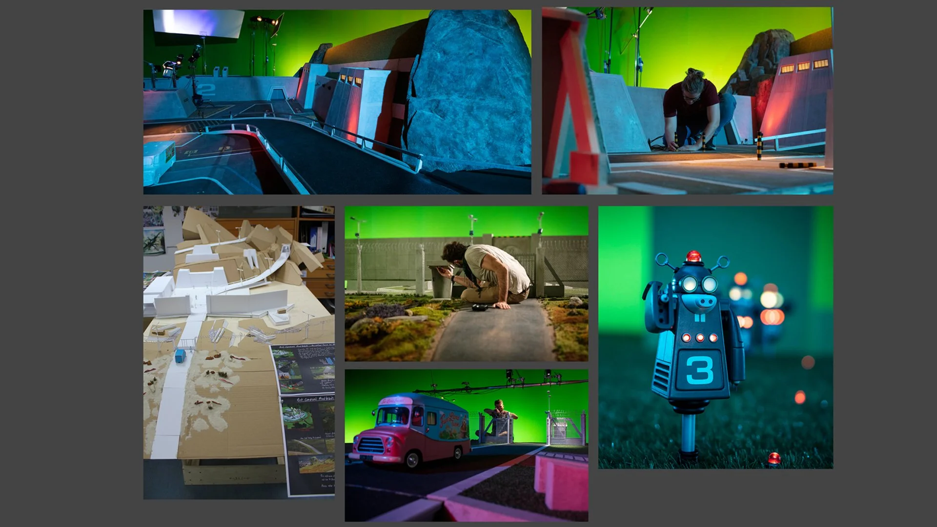
The scale of this environment also presented one of the film’s key production challenges, requiring the world to extend beyond the physical stop-motion sets while maintaining the tactile aesthetic of the film.
THE CONTROL ROOM
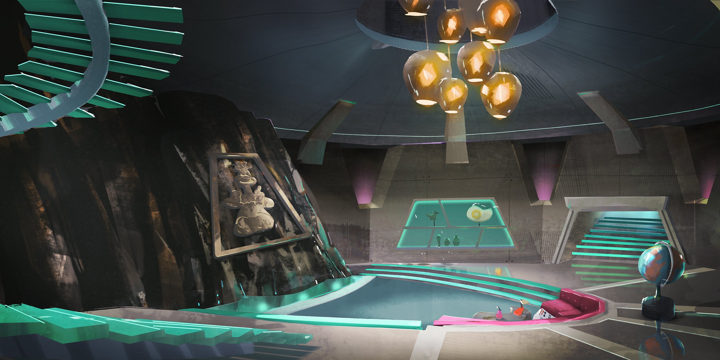
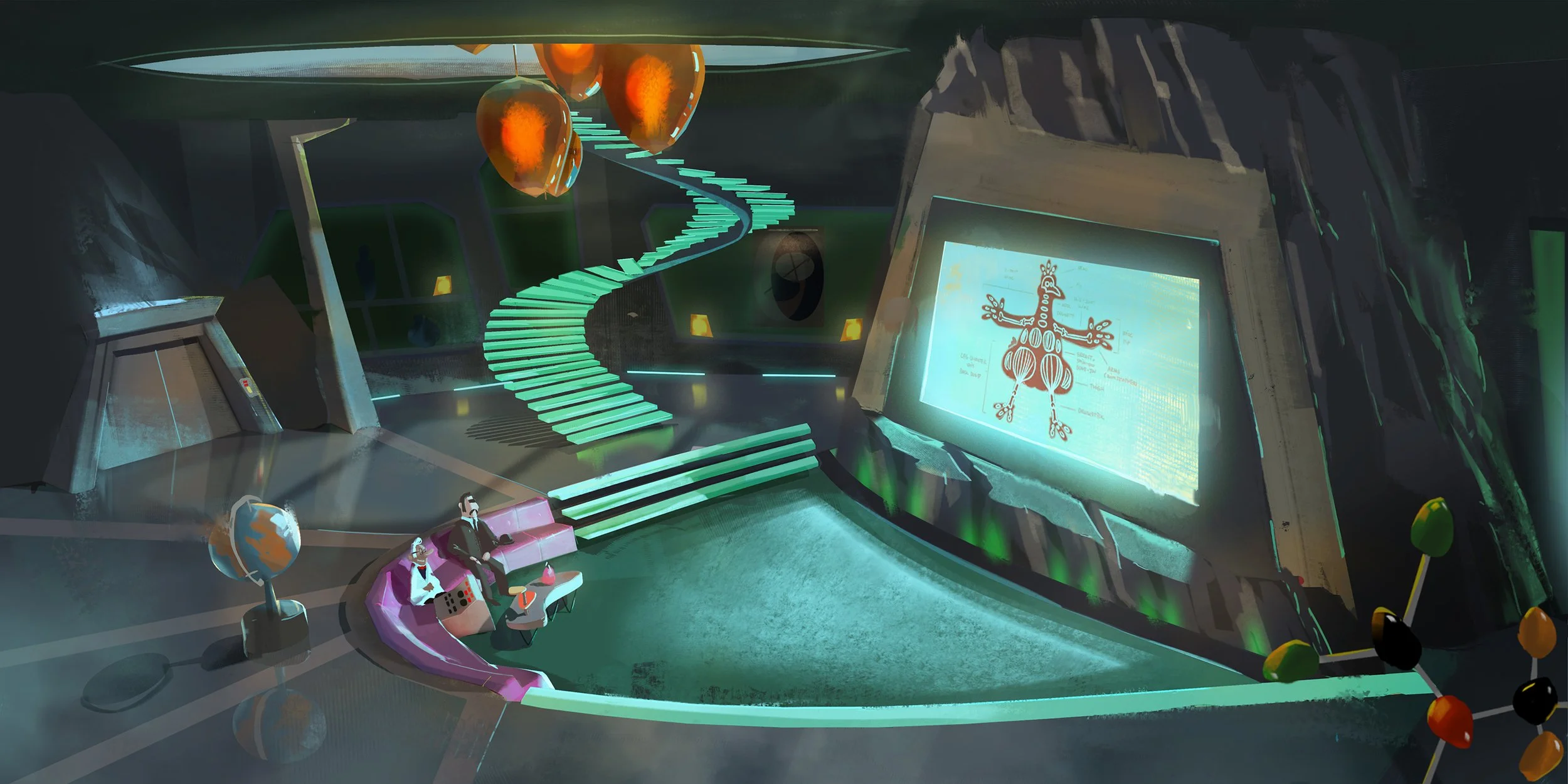
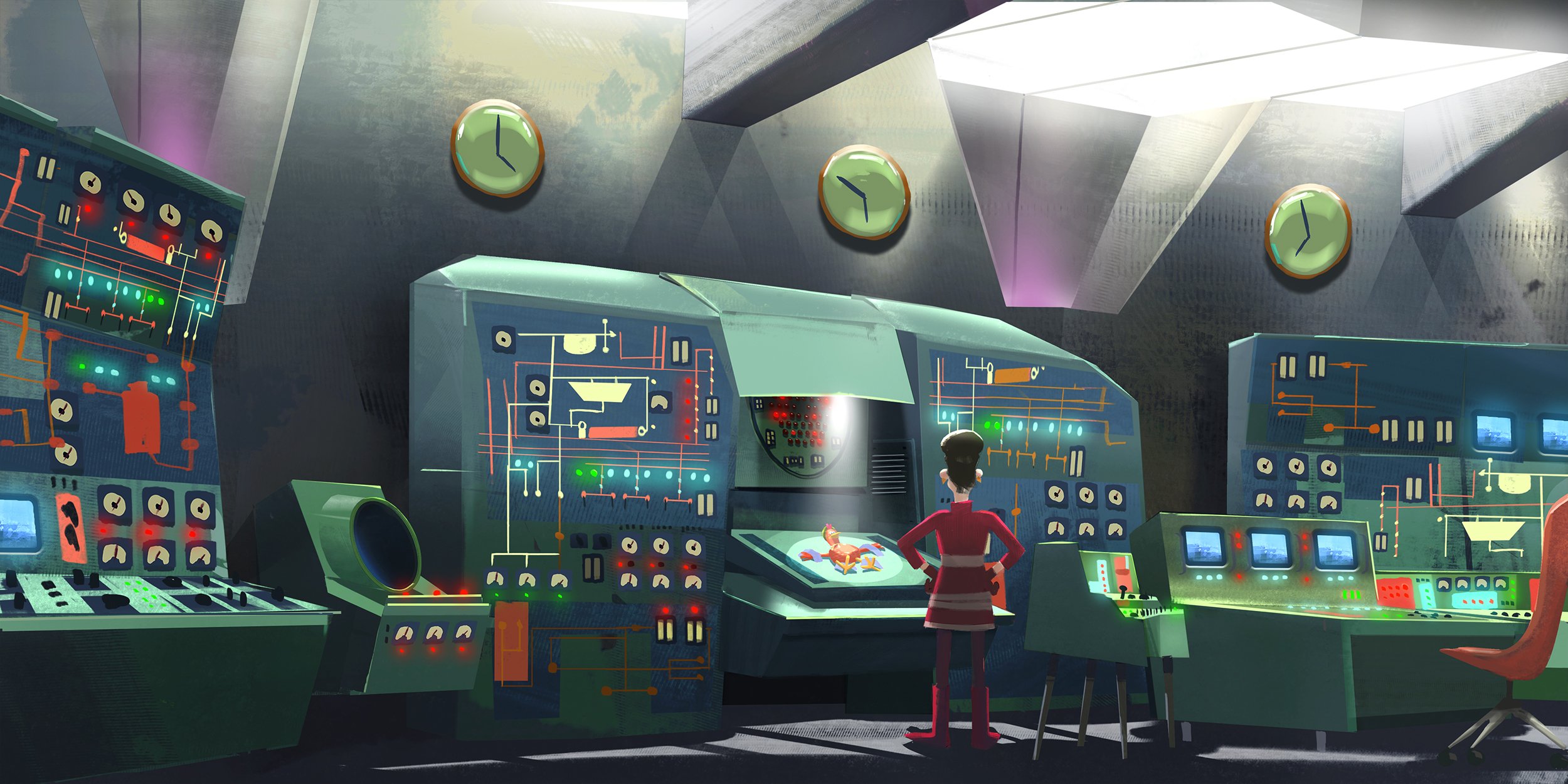
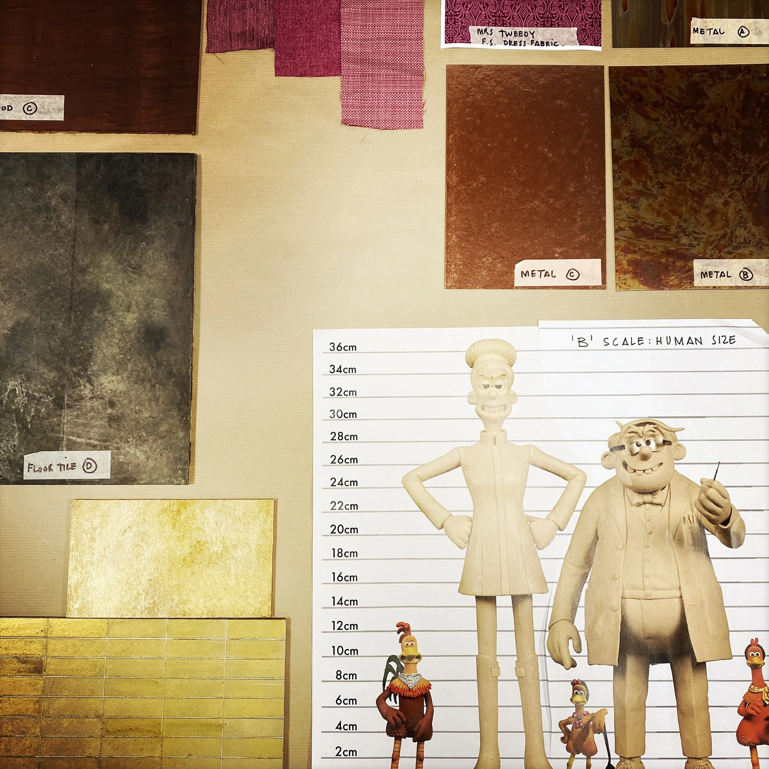
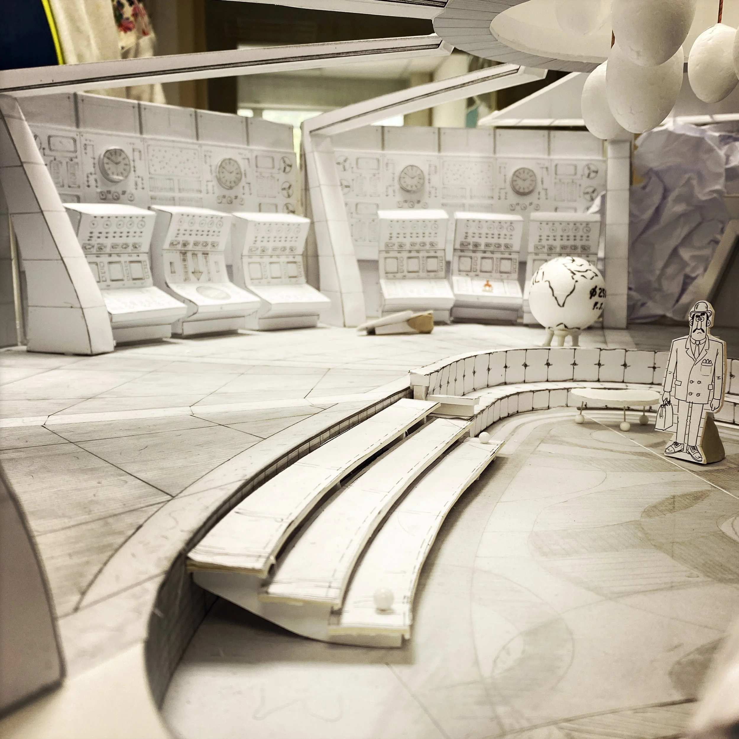
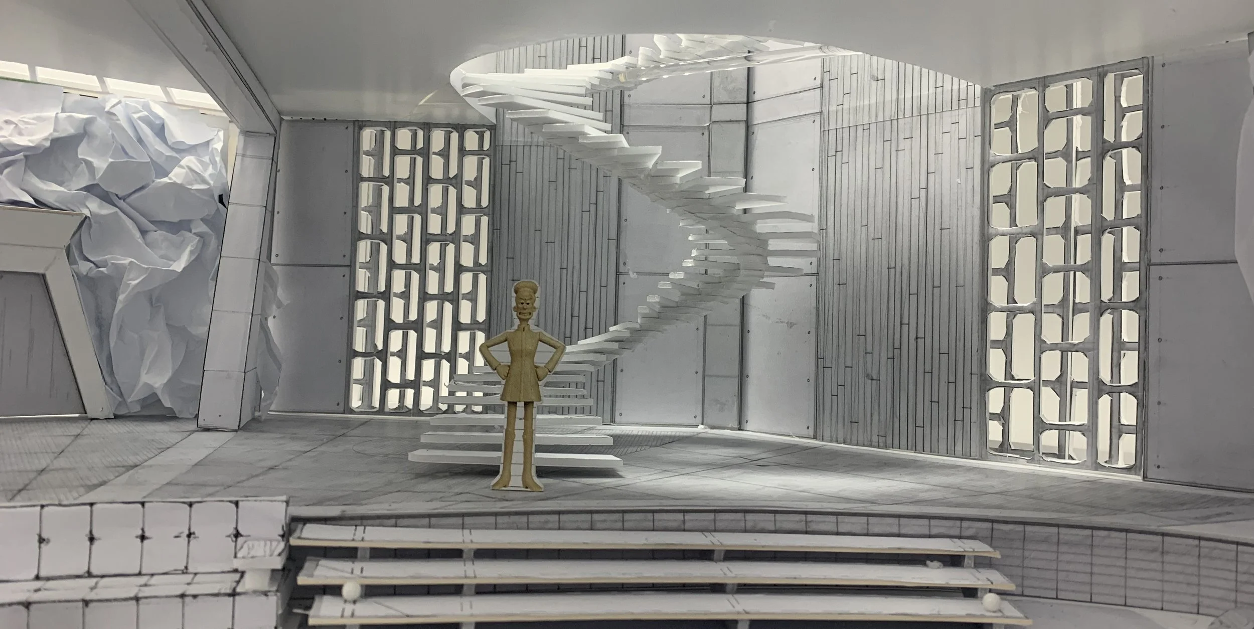
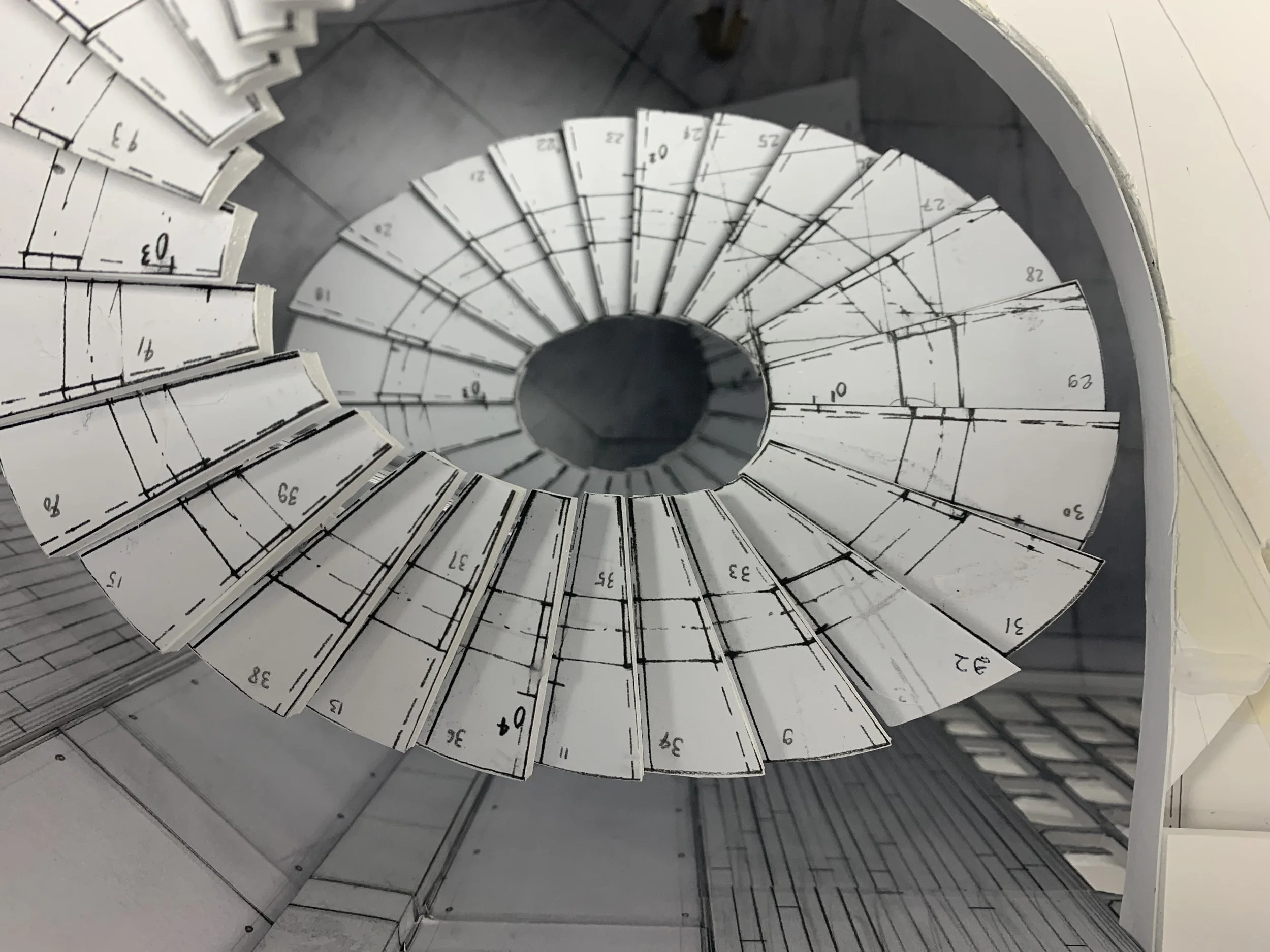
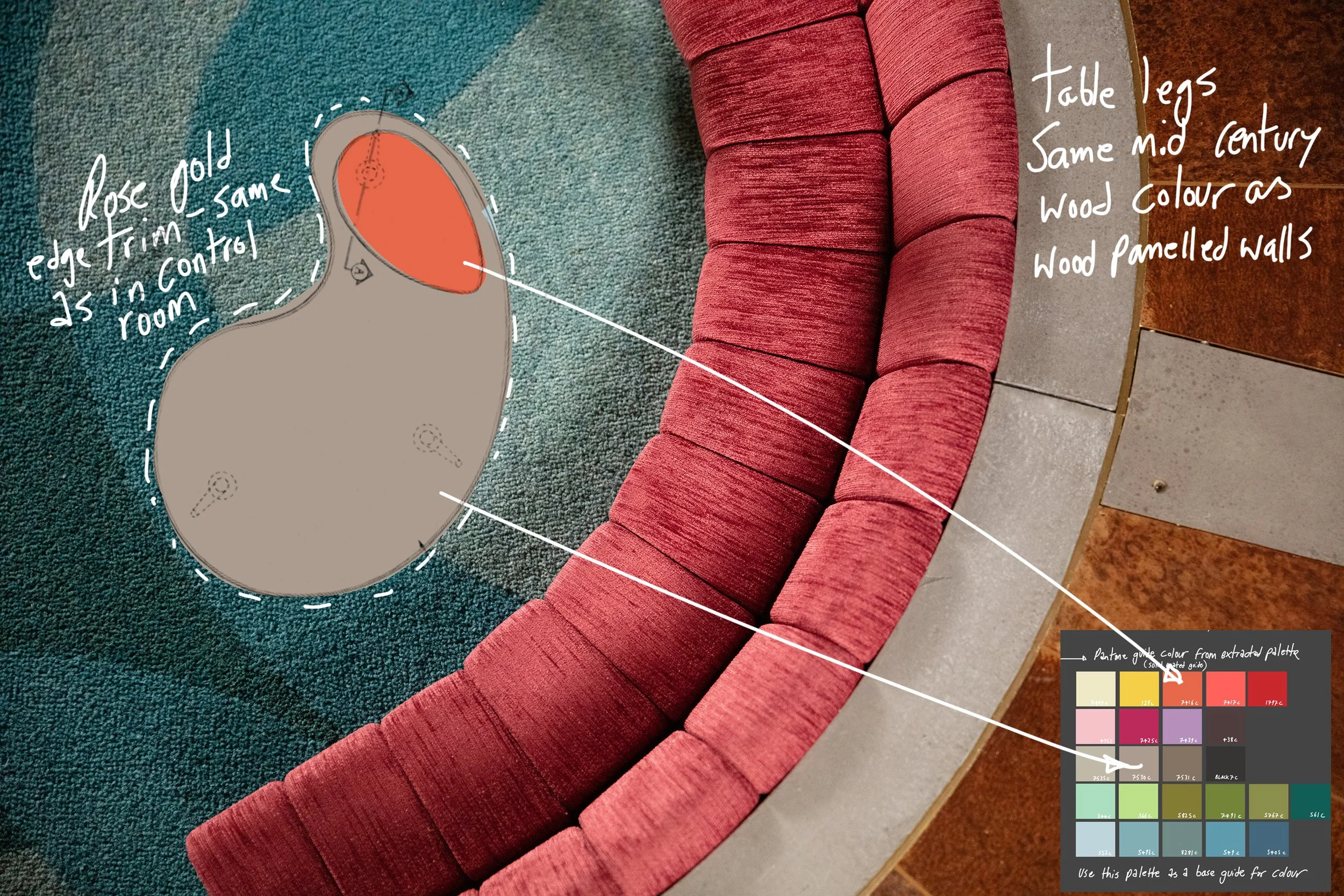
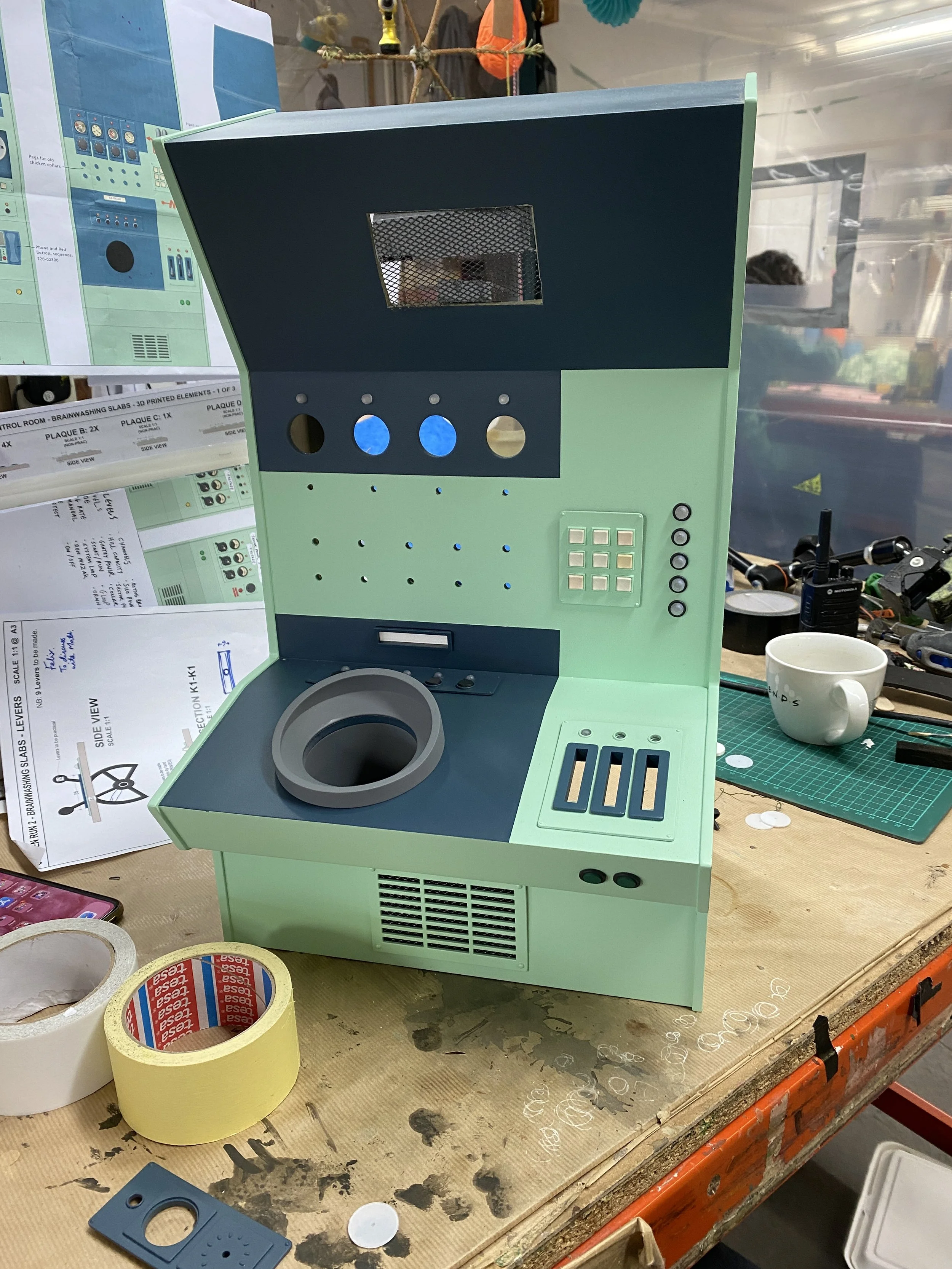
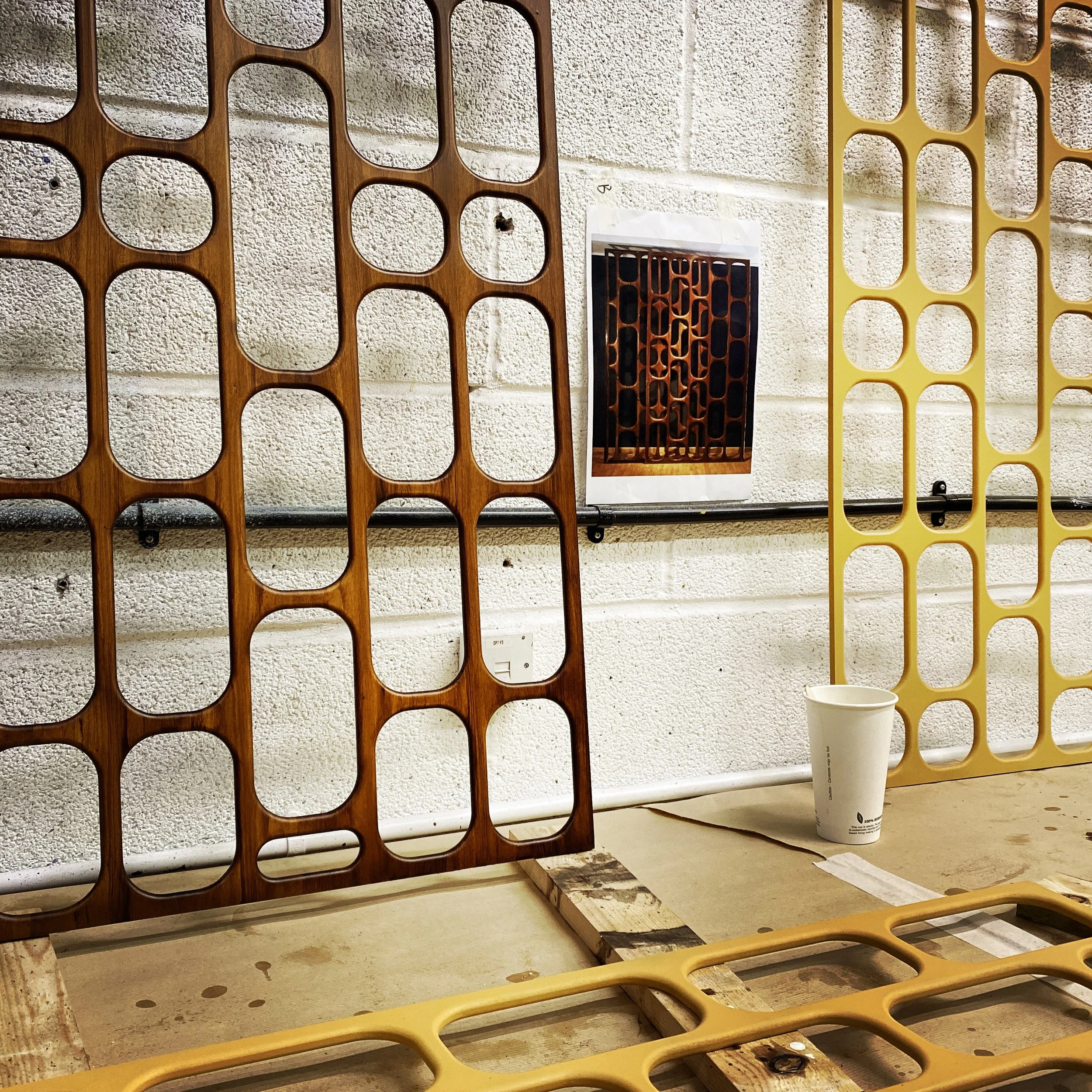
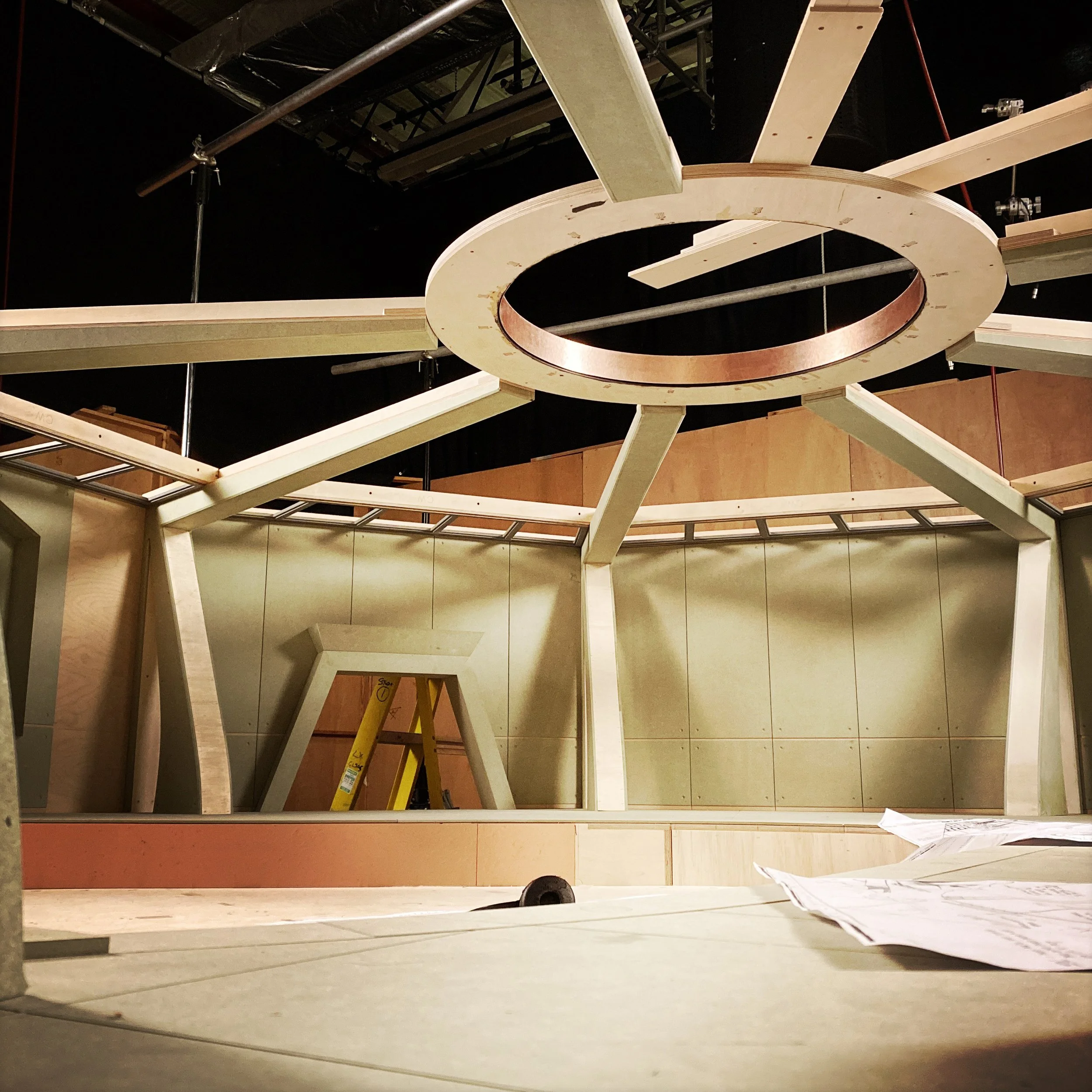
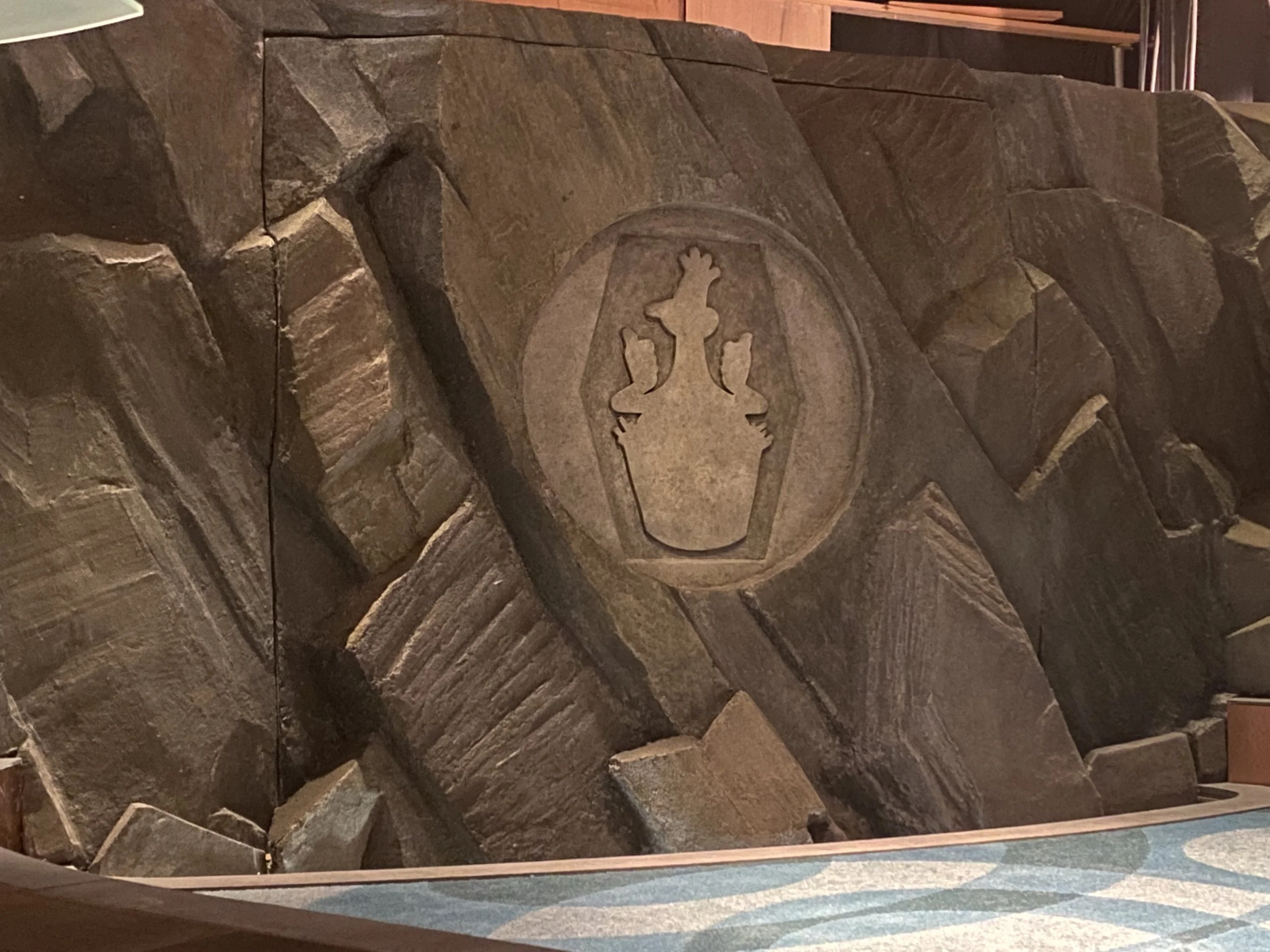
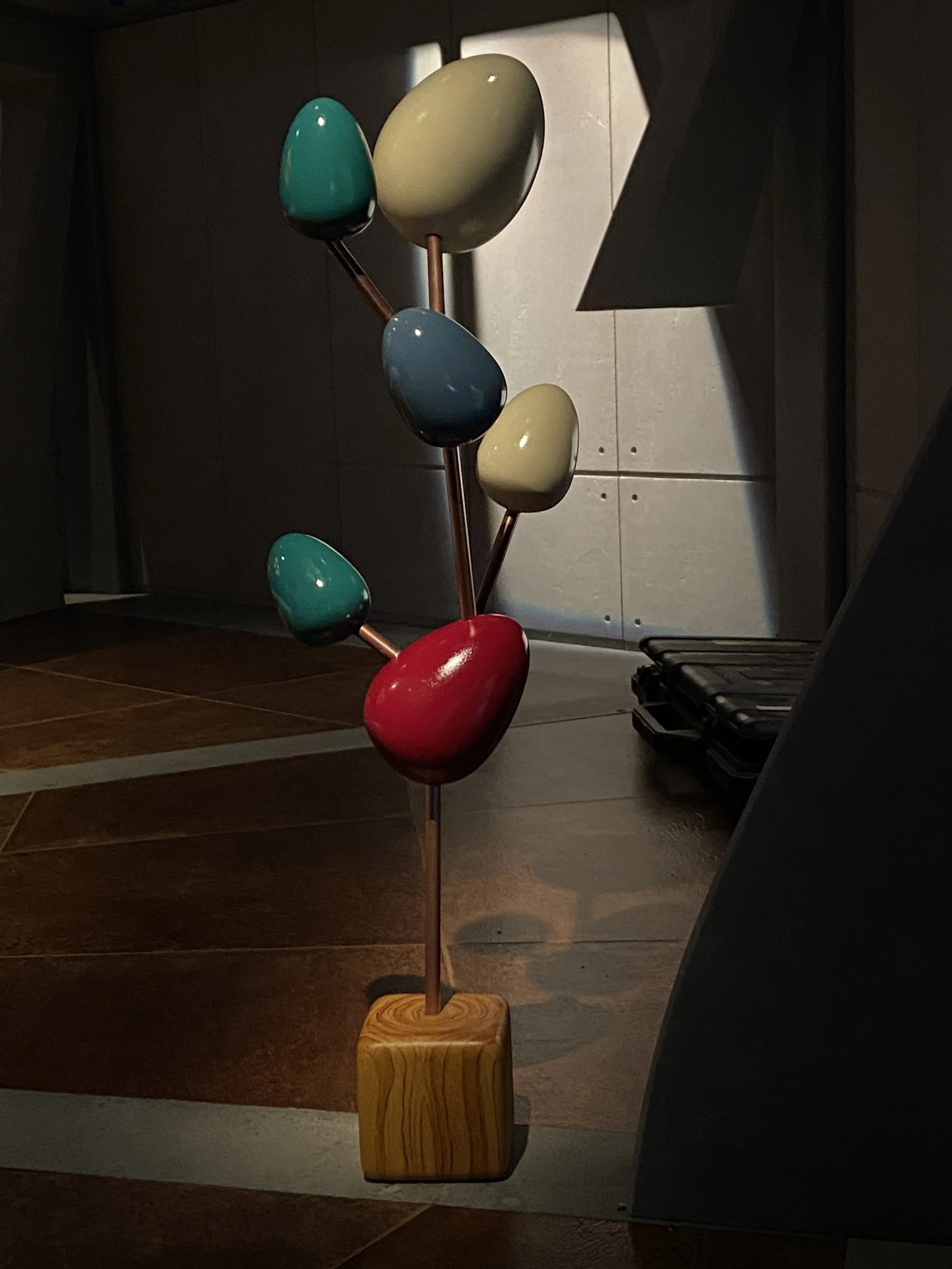
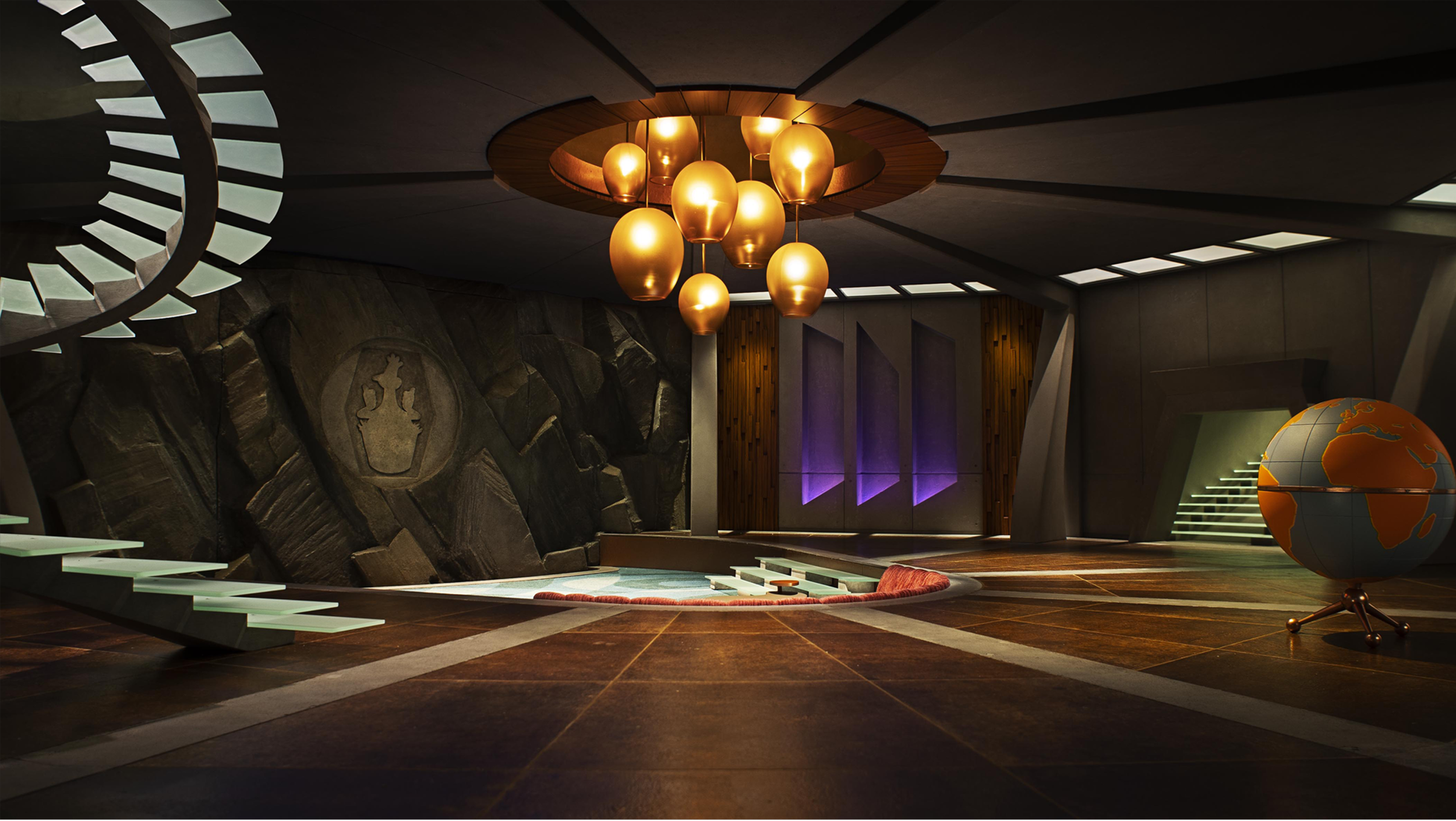
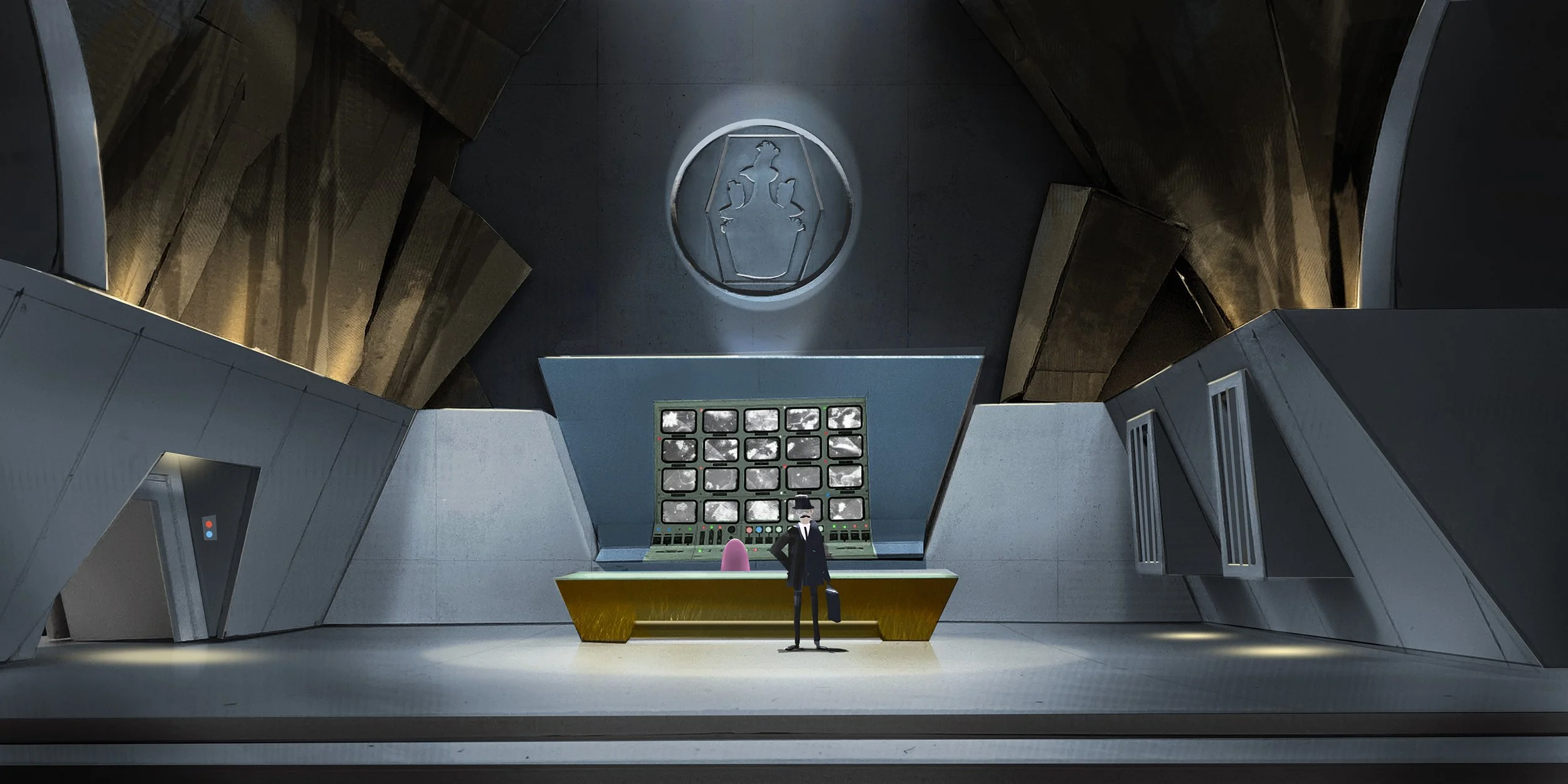
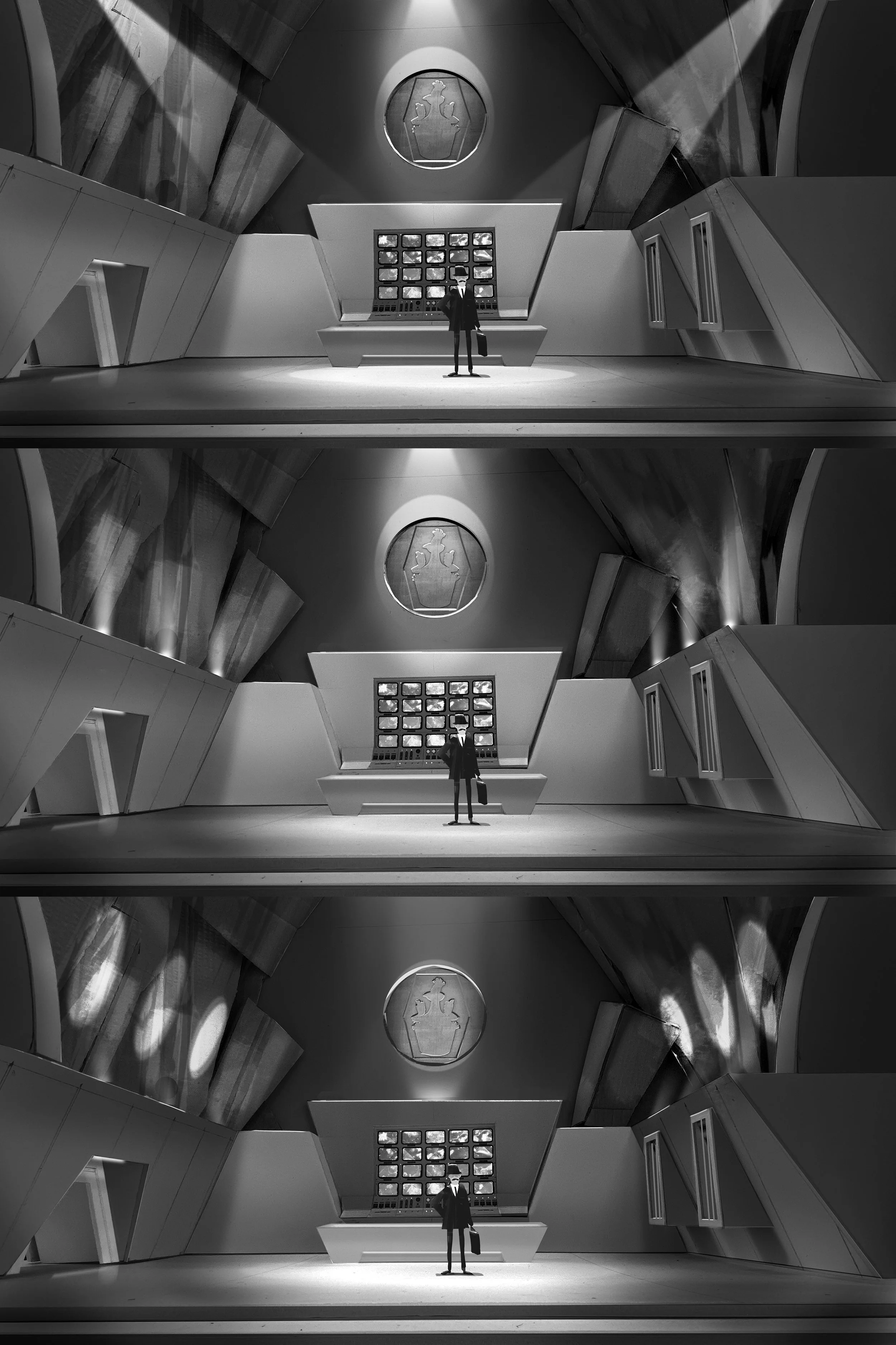
The control room and brainwashing facility were designed as the heart of Tweedy’s Bond-style lair — an imposing, theatrical space built around the idea of the grand entrance. A sweeping, elaborate stairwell dominates the room, allowing Tweedy to descend into the space with the kind of exaggerated reveal you might expect from a classic Bond villain.
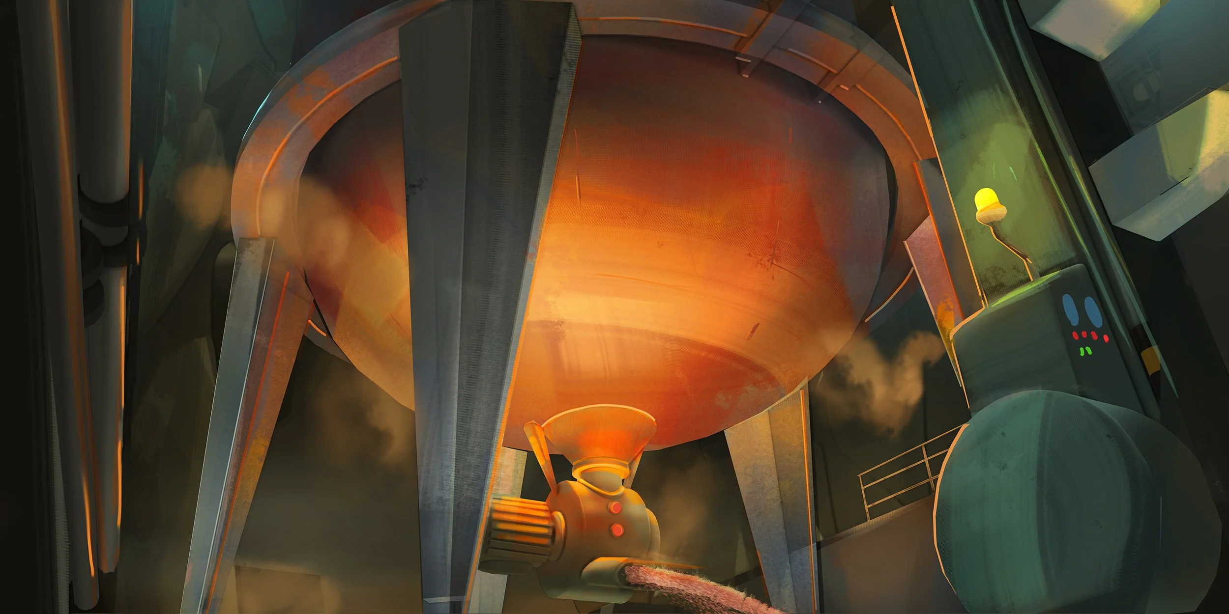
Monumental architecture, dramatic geometry and an almost excessive sense of scale helped create a world that was both sinister and knowingly absurd, while the machinery and technology of the brainwashing facility added another layer of menace beneath the polished, futuristic surface.
It was my favourite set to design, and was beautifully crafted and led by art director, Sarah Hauldren.
INTERIOR COMPOUND SECTORS

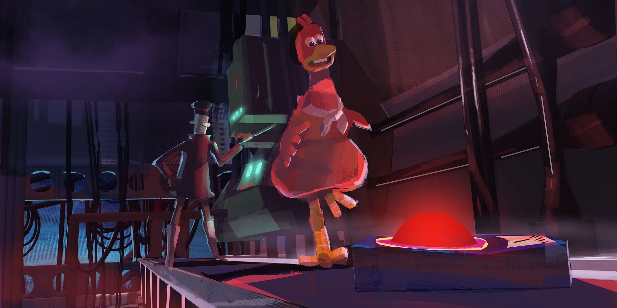
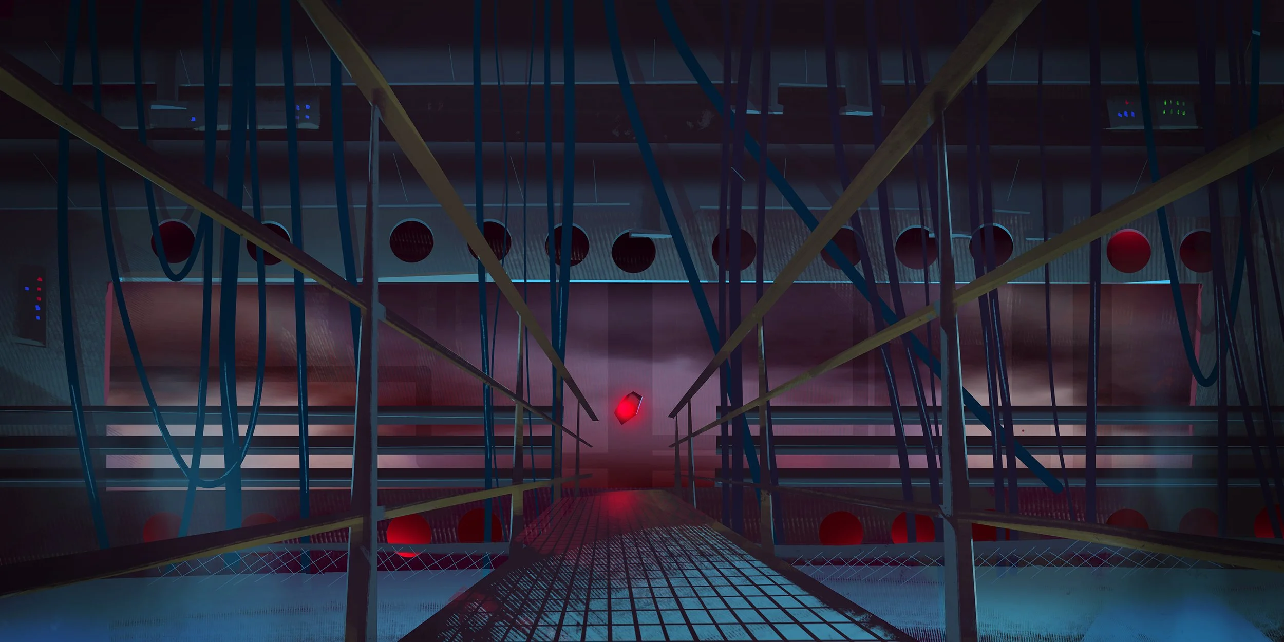
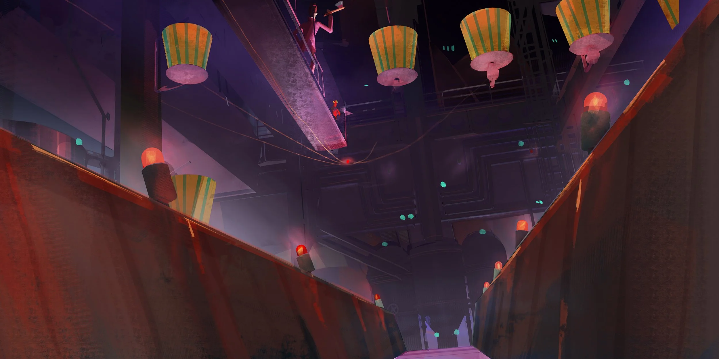
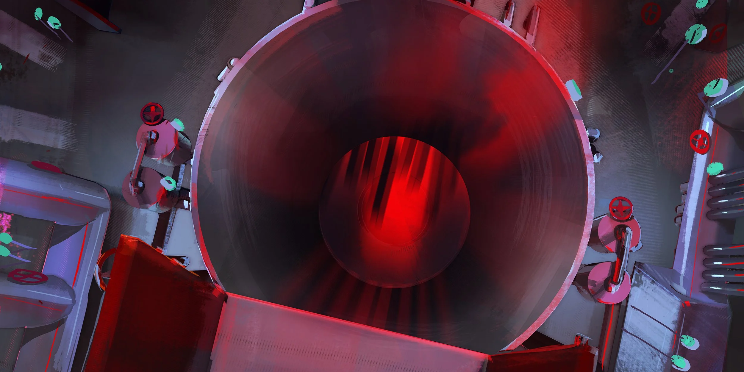
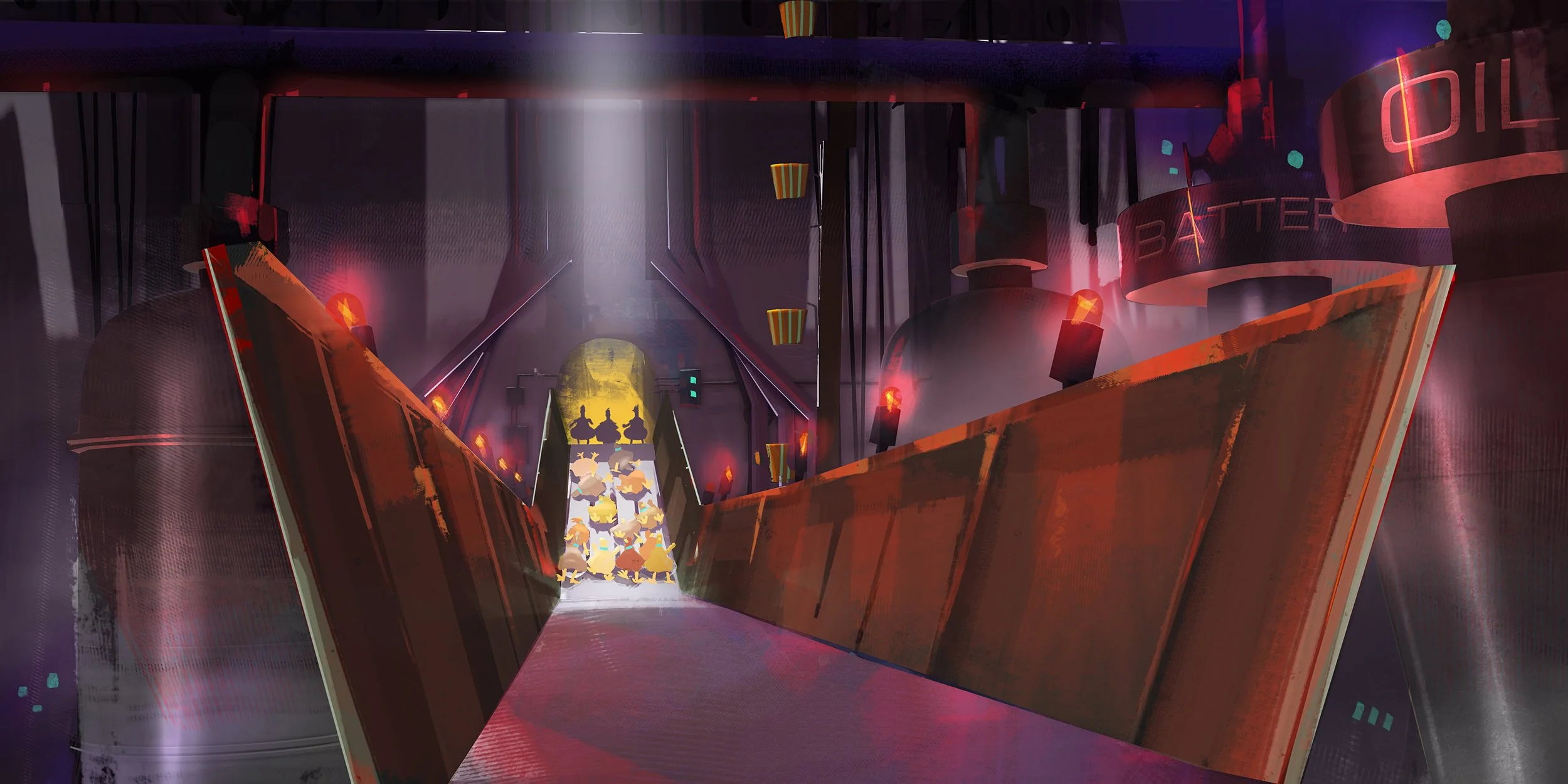
COMPOUND VR DESIGN
FUNLAND
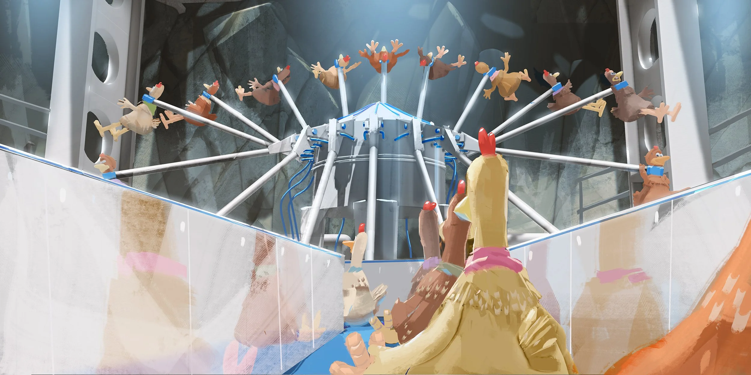
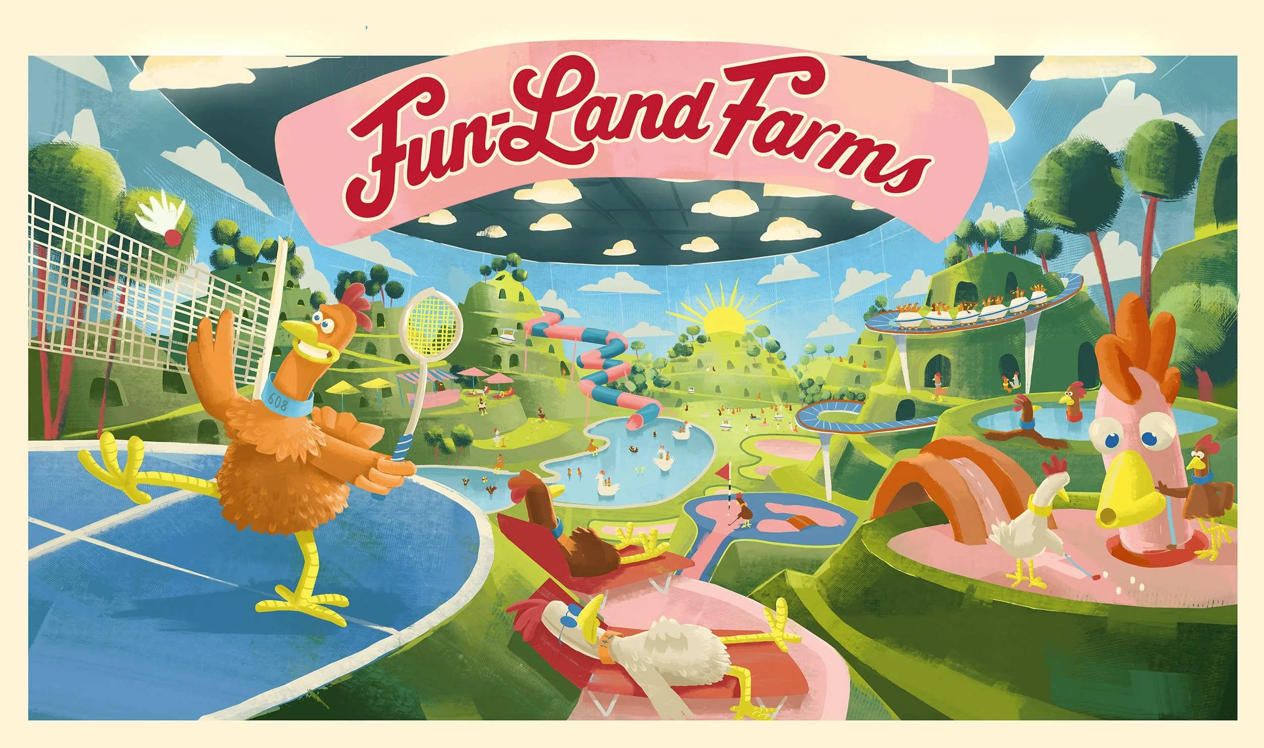
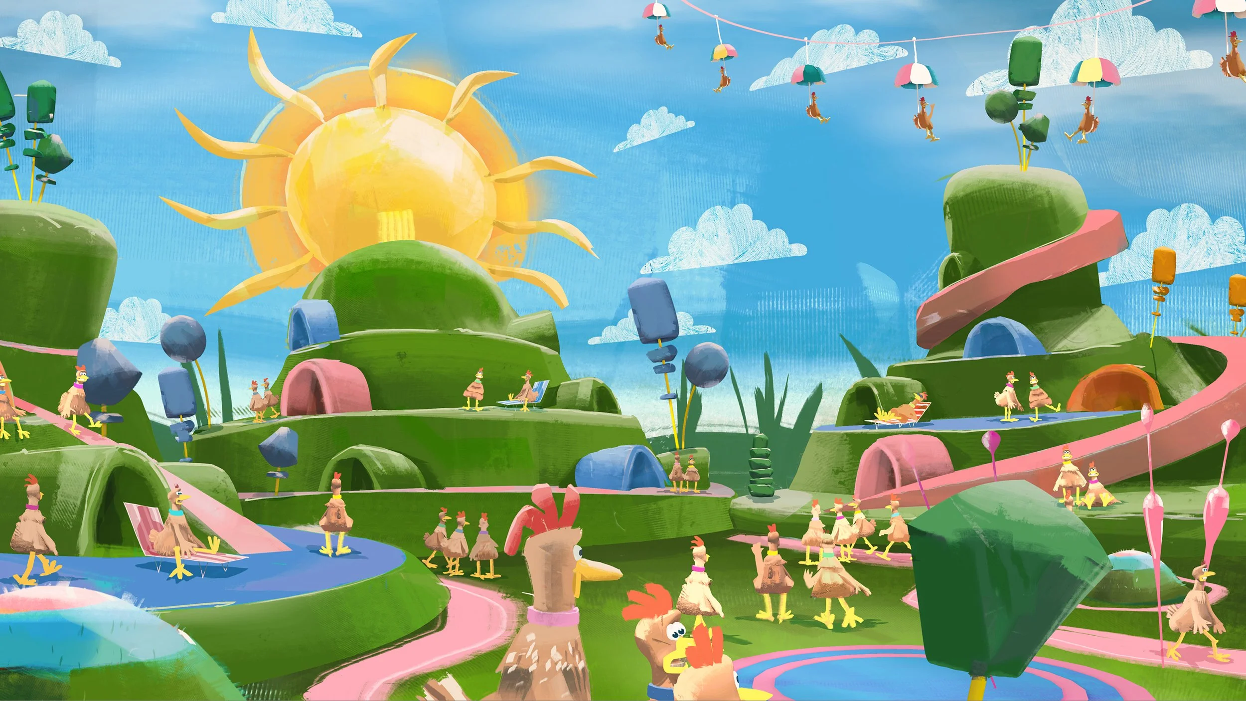
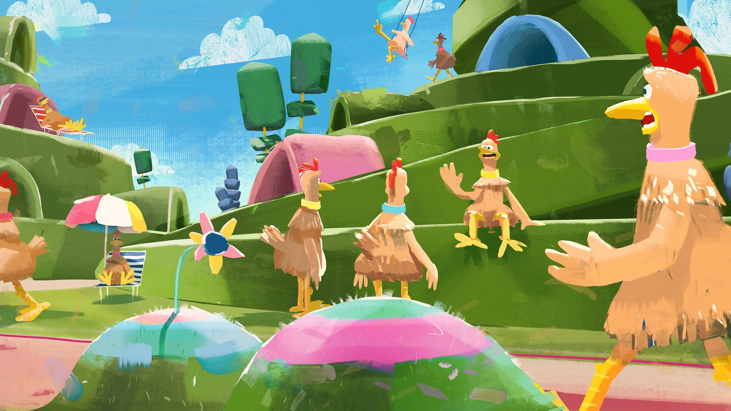
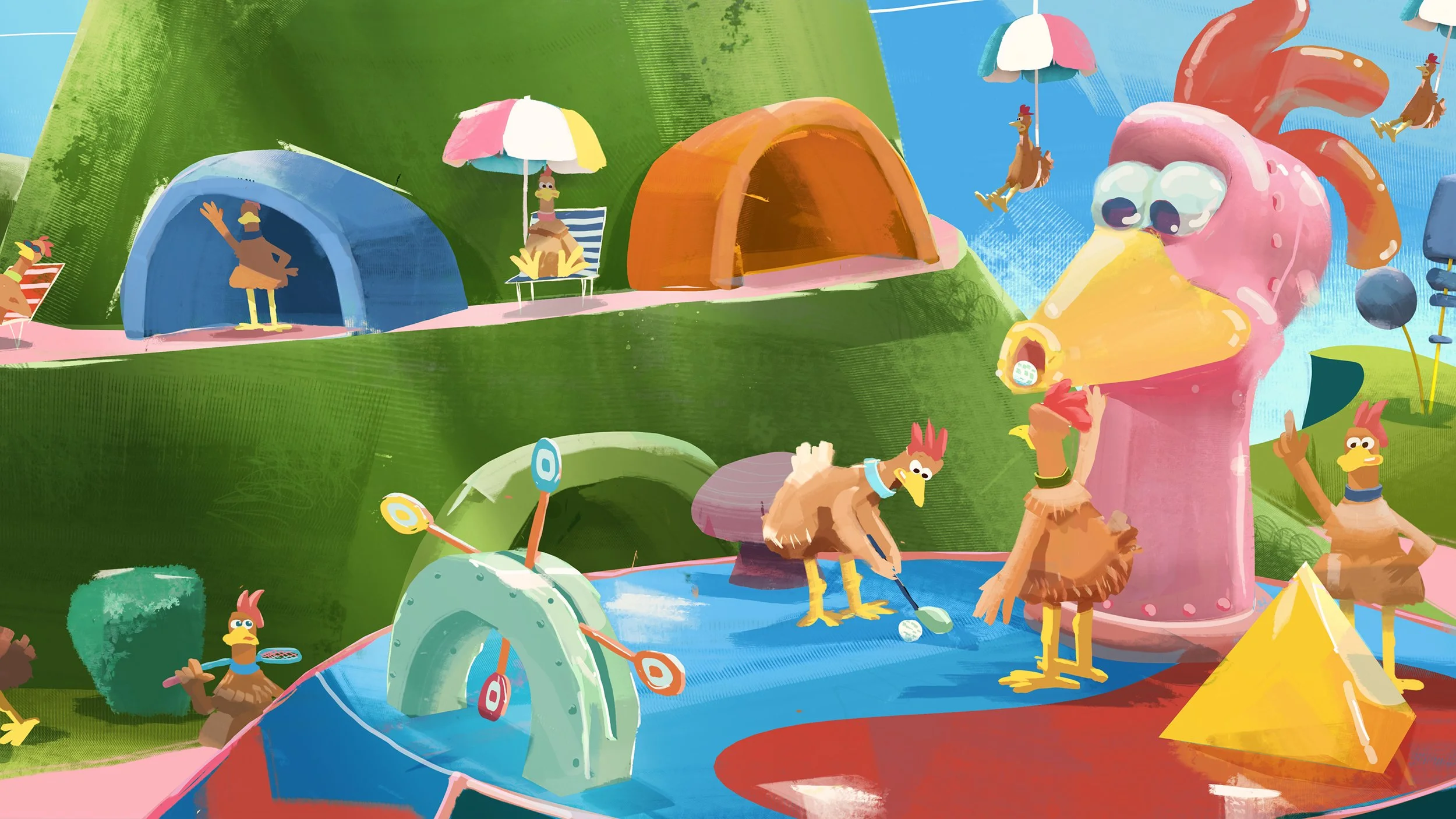
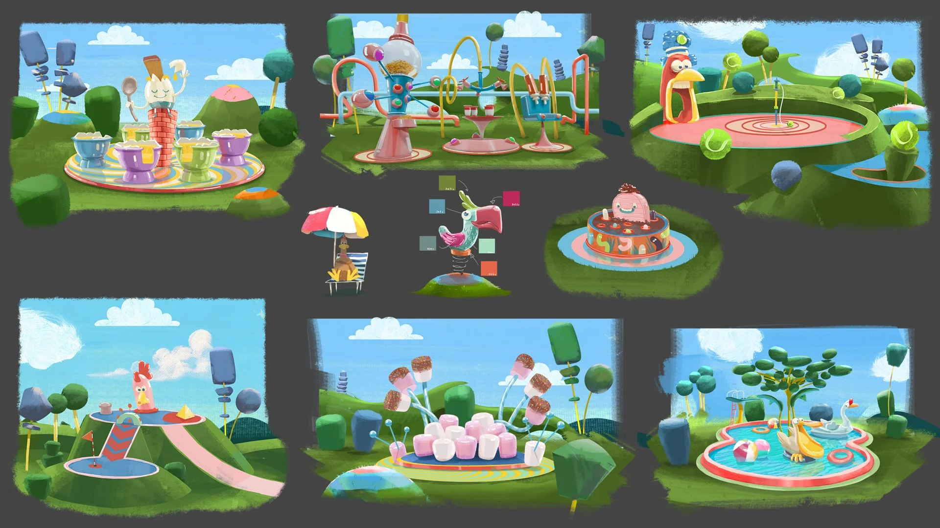
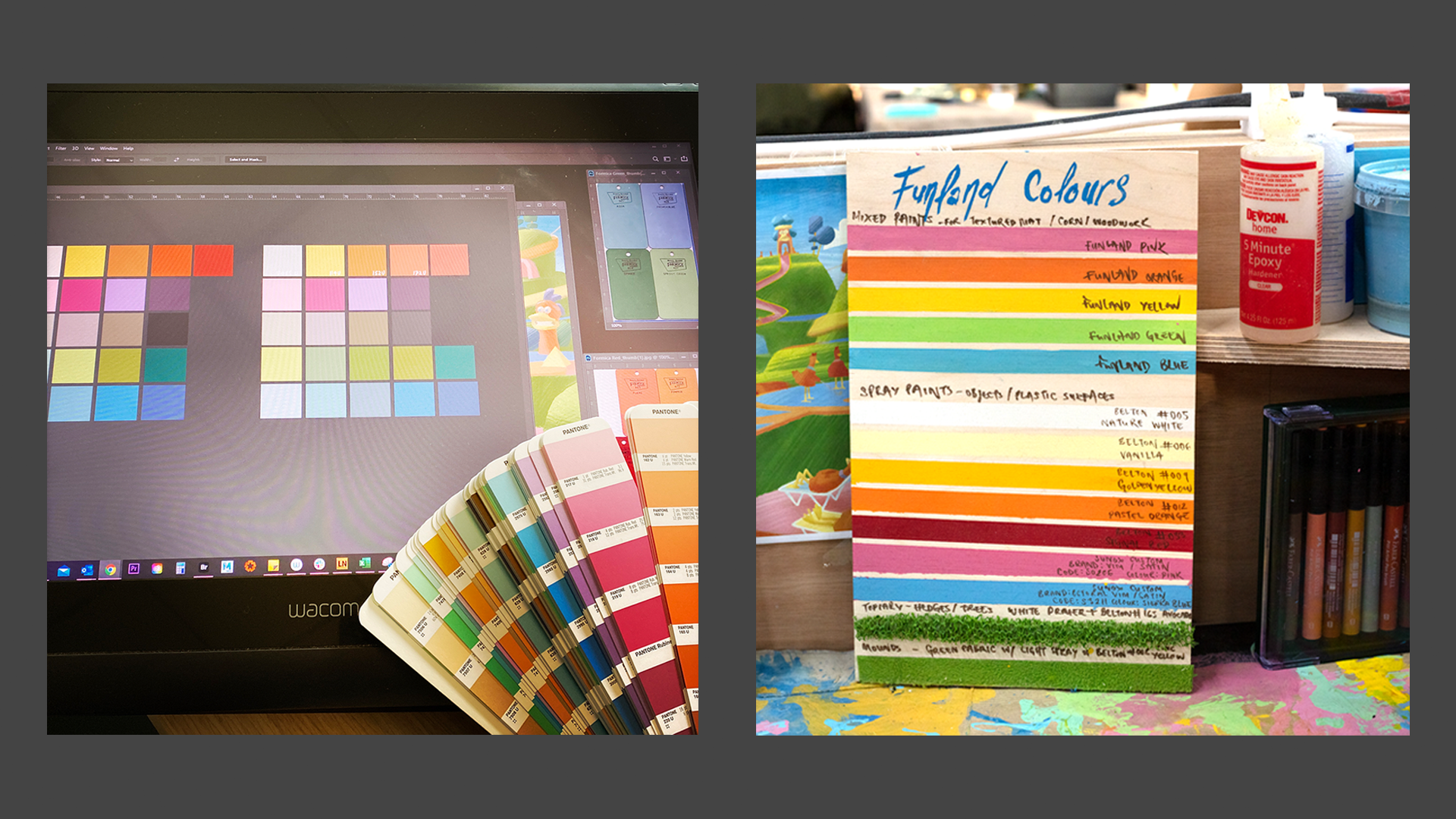
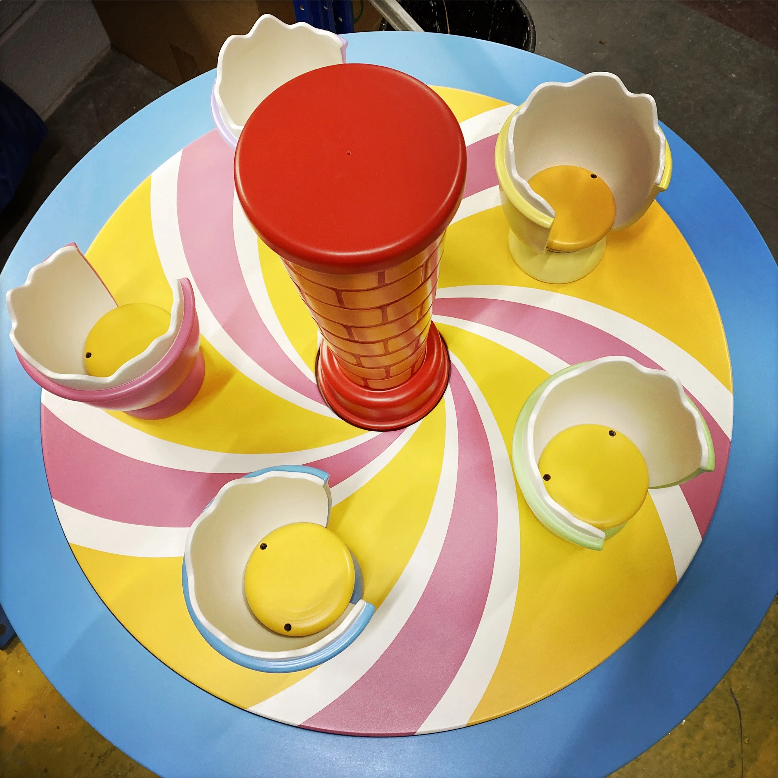
Fun-Land was conceived as a twisted version of Butlin’s… for chickens - an irresistibly cheerful holiday resort hiding a much darker purpose. I drew on 1950s and 1960s Disneyland, British holiday camps, amusement parks, Formica, pastel colours and mid-century graphic design to create a world that felt bright, nostalgic and inviting, while becoming increasingly unsettling beneath the surface.
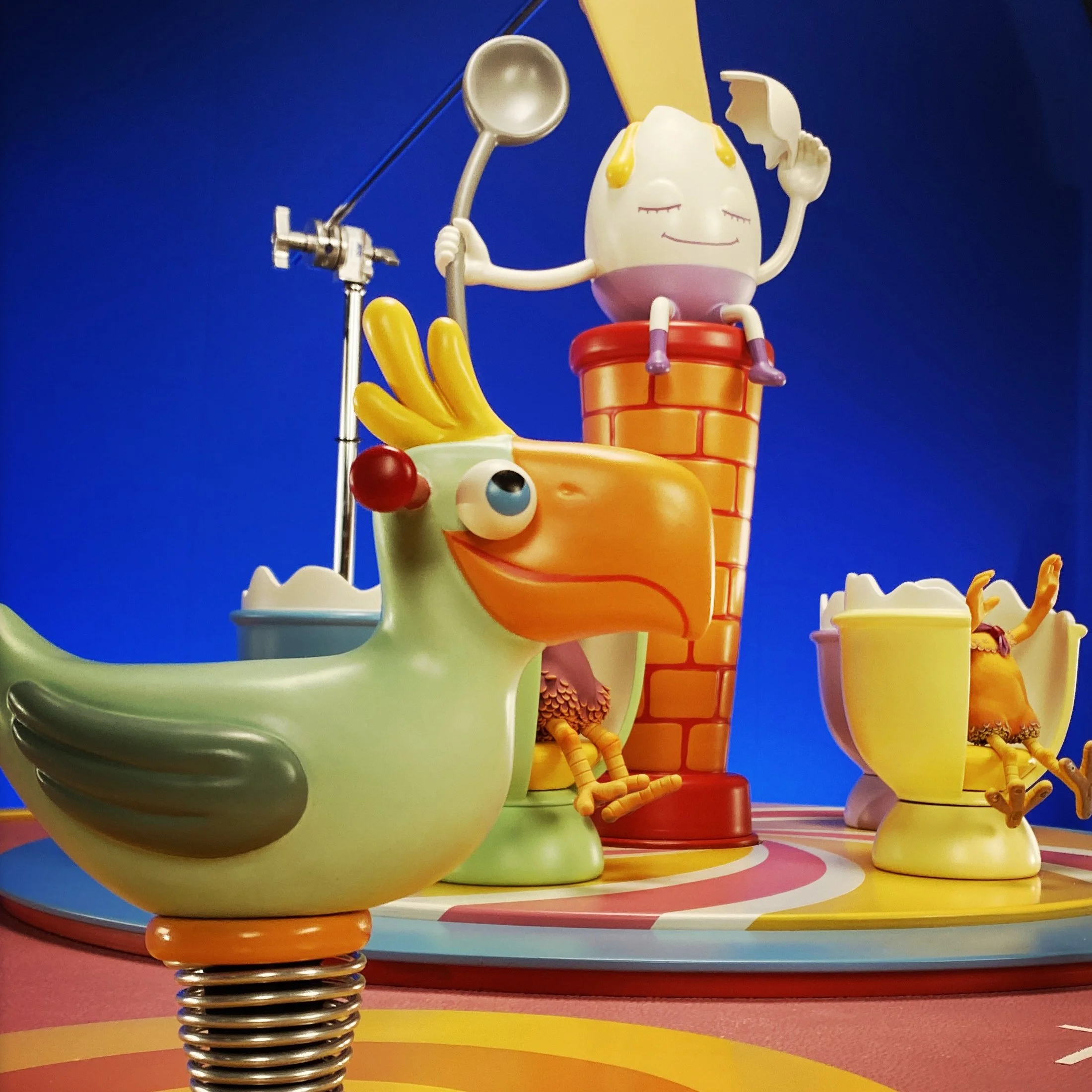
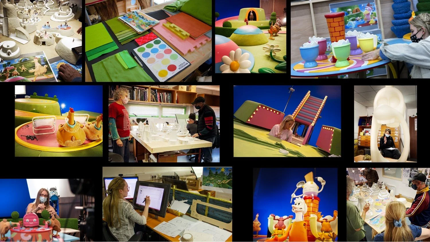
Its enormous scale made it impossible to build entirely as a physical environment. Instead, we developed a hybrid approach, of physical sets and characters with a virtual extension of the world. This allowed us to retain the tactile qualities of stop motion while creating a much larger environment around it — a combination of traditional craft and new technology that became central to the visual language of the film.
Again, the location was designed in VR and shots were scouted by the director and head of story to finesse the story sequences ahead of set construction.
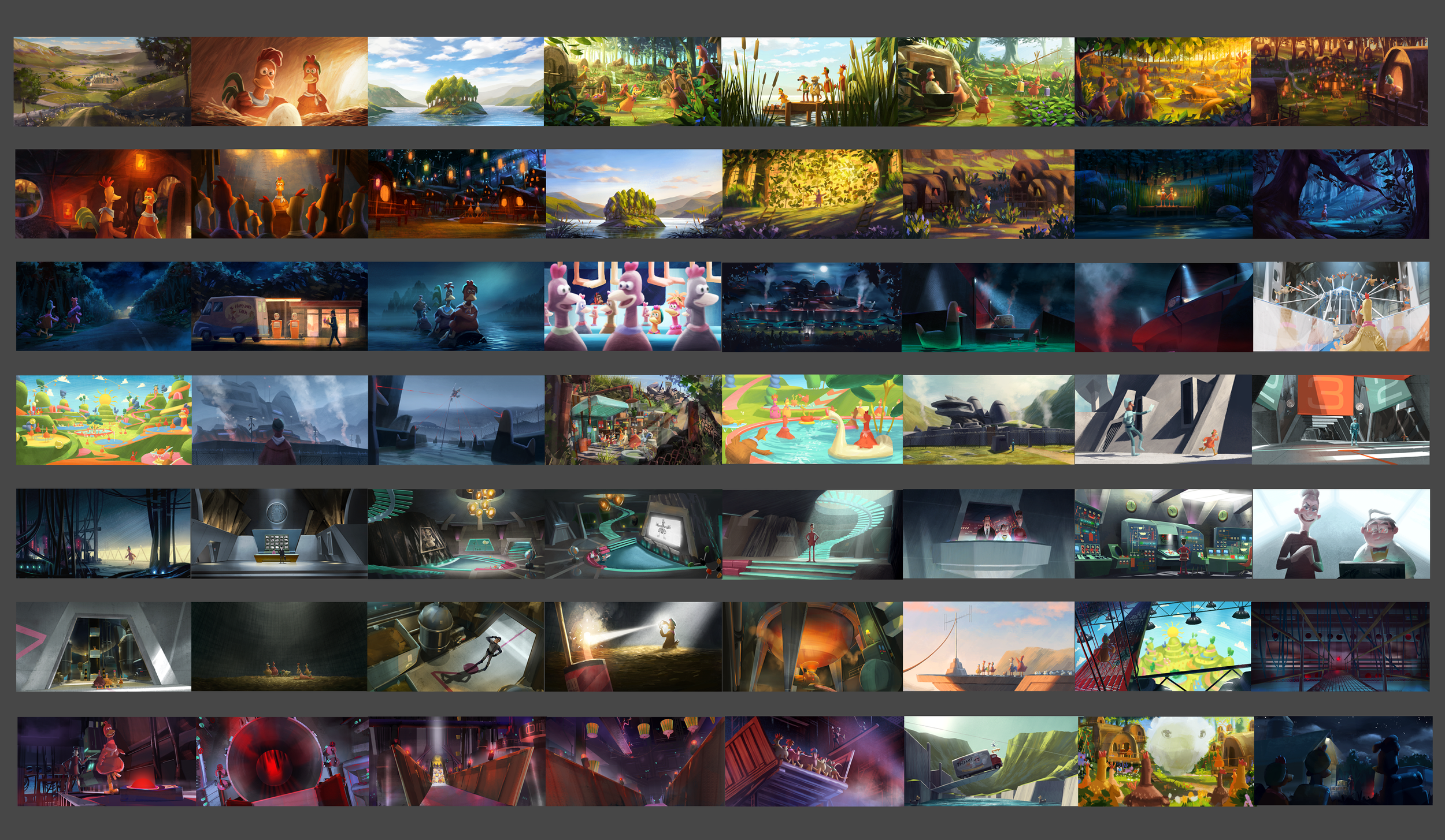
COLOUR SCRIPT
I worked closely with director, Sam Fell, DOP, Charles Copping and artist, José Prats to create the film’s colour script and map out the look of picture. José completed the majority of the script whilst the script also grew directly from the VR environments I developed into lighting keys during the production.